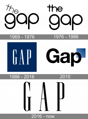
Throughout its almost 50-year history, the clothing line Gap has seriously redesigned its logotype only once. There were also a couple of minor modifications and an unsuccessful redesign attempt in 2010.
Meaning and history
The iconic fashion brand, which name and logo today is known all over the world, started in the 1960s under the name Generation Gap, to symbolize a leap into the future and progressive approach of a casual young brand.
A few months later, the owner decided to relive the first part of the brand’s name, keeping “The Gap”, which turned into the “Gap” we all love today in the 1980s.
1969 — 1976
The original Gap logo, introduced in 1969, featured a playful and friendly logotype in a monochrome color palette. Two parts of the inscription were set on different levels, with “The” places diagonally above the “Gap”. The rounded sans-serif typeface of the wordmark made it look sleek yet cool and funny, while the difference in thickness of the lines of two parts, and the connected bars of “T” and “H”, added individuality and uniqueness.
1976 — 1986
In 1976 the logo was redesigned and became stricter, yet more confident and professional. The diagonally locates “The” was Joe written in parallel with “Gap”, in a straight line. All the other details, including the black-and-white color palette, remained untouched.
1986 — 2016
The iconic blue and white logo appeared in 1986, right after the shortening of the brand’s name to “Gap”. It was a white logotype in capitals of a sleek and classy serif typeface, placed on a calm blue square. The narrowed lettering was brilliantly balanced in terms of sizes and spacing and looked bright, dress, and exquisite in a new color palette.
2010

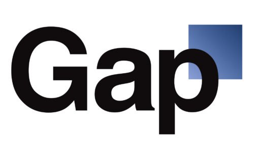
In 2010 the brand introduced its new logo, consisting of a black title case logotype with a gradient blue square on the upper right part. It was something completely different from what people got used to seeing as the label’s signifier, so the logo only lasted for one week and was replaced by the previous version again.
2016 — Today
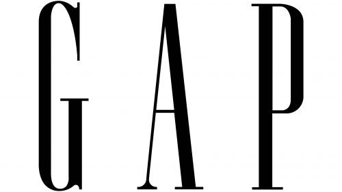
The redesign of 2016 simplified the iconic blue and white logo version to a monochrome combination, with black lettering on a white background. The typeface of the wordmark remained the same, but today the letters are placed further from each other, which adds a very sophisticated and light feeling.
Font
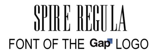
The condensed serif font used for the Gap logo resembles the Spire Regular typeface developed by Ann Pomeroy. The typeface was definitely customized, which can be clearly seen if you take a closer look at the serifs and their thickness.
Color
The original and the current logotypes share the same black-and-white color scheme, while the wordmark used in 1986-2016 featured white and a saturated shade of dark blue.


