Futurama is a famous animated series, telling about the interplanetary adventures of the main character, Philip Fry. The sitcom was created by Matt Groening in 1999 and by today 140 episodes were released in 7 seasons.
Meaning and history
One of the most famous animated series in history, Futurama, was created in 1999 when Simpsons creator Matt Groening decided to turn to sci-fi ideas and began working on the series with a slight change of focus. According to the plot, the main character Fry works part-time as a pizza delivery guy. During one of the deliveries, he accidentally enters the lab and gets into a cryogenic chamber, which freezes him for a thousand years. Further action of the cartoon series takes place in the year 3000, where he finds himself.
This animated series is often called a light version of The Simpsons because it retains all of Groening’s humor, but almost no social themes. There are more ridiculous and funny characters like the alien lobster Zoidberg, the robot Bender, and the one-eyed Leela. And the jokes are often based on some ridiculous future laws or strange alien behavior.Most of the episodes’ plots involve delivering some kind of cargo to an unusual planet, where something dangerous or funny happens to the characters.
What is Futurama?
Futurama is the name of one of the world’s most famous animated tv shows, created by Matt Groening, the author of The Simpsons, at the end of the 1990s. By today there have been several seasons with more than 140 episodes of this interplanetary comedy released.
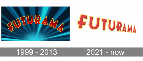
1999 – 2003, 2008 – 2013
The simple text-based Futurama logo is modern and memorable. Composed of a wordmark in a contrast color palette, it looks confident on any background and ap-pears at the beginning of every Futurama episode.
The Futurama nameplate in all the capital letters is executed in a custom hand-drawn sans-serif typeface, with a slightly elongated horizontal bar of “R”, the letter “F” forming kind of cross and the horizontal bars of both “A” replaced by triangles with their peach facing down.
The Font based on the Futurama logotype was created by Darrell Johnson and is called “Futurama”.
The pointed tops of “A”s and “M” make the whole logo look sharp and futuristic as if they are pointing into the future, or up in the Space.
The three-dimensional lettering features red color, which boasts gradient shades in order to add a sense of motion, in a thin yellow outline, which makes the inscription more distinct and visible.
The Futurama logo is simple yet strong. It reflects power and progress, representing the nature of the series and its futuristic story.
2021 – Today

By 2021, Futurama started airing again on multiple TV-channels. For this edition, they updated the logo. It’s mostly the same design, except they straightened the word out, slightly reworked the shading and coloring and also added perspective. Otherwise, it’s mostly the same.
Font and Color
The custom heavy uppercase lettering from the primary Futurama badge is set in a sharp geometric sans-serif typeface with stable characters and clean contours. The closest fonts to the one, used in this insignia, are, probably, Italiano Fushion New Semi Bold, or Mostar Nuova Extra Bold, but with some significant modifications of the characters’ contours.
As for the color palette of the Futurama visual identity, it is based on red and yellow, which are not executed in their brightest hues, but still evoke a sense of passion and energy, making up a powerful and confident image with a recognizable character and funny mood.


