AMC Theatres is the name of the cinema-theaters chain, which was established in 1920 in the United States. By today the chain has grown into one of the country’s leaders in their segment with more than a thousand locations across the USA, and 11 thousand screens.
Meaning and history
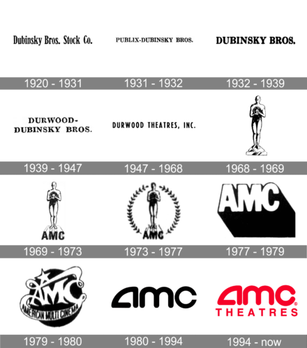
The visual identity of AMC Theatres during its first era featured a simple capitalized inscription with various taglines. From the 1920s and until 1980 the cinema chain was called “American Multi Cinema”, so there was no need for additional graphics and framing due to the length of the name.
1920 – 1931
The logo for Dubinsky Bros Stock Co, the predecessor of AMC Theaters, was created in 1920 and featured a black title case logotype set in a bold and elegant serif font with softened cuts and serifs of the characters. The inscription was slightly narrowed to fit the complete name of the company in one line.
1931 – 1932
In 1931 the company was renamed Publix — Dubinsky Bros, and the logo was changed in the same year. It was stillblack lettering on a plain white background, but now the wordmark was written in the uppercase of a full-shape serif font with more distinctive contours and sharper serifs, than in the typeface of the previous logo.
1932 – 1939
The “Publix” part of the company’s name and identity was removed in 1932, and now it became Dubinsky Bros, with the logo rewritten again. The lettering in the uppercase was executed in a bold and smooth serif font, resembling the original badge of the company, but with cleaner contours and more confident shapes of the characters.
1939 – 1947
In 1939 Dubinsky Bros merged with Durwood, forming the Durwood — Dubinsky Bros company. The logo for the new name was set in the same style, with the black uppercase inscription set against a white background, but now it was set in two levels, and the font of the lettering was refined, with the shapes of the characters getting a bit wider.
1947 – 1968
The redesign of 1947 followed the rename of the company to Durwood Theaters. Under this badge, the company kept working for more than twenty years. It was a sting and clean uppercase wordmark in a modern sans-serif font with interesting geometric contours of the characters. The inscription was still set in black on a white background but looked very progressive and stylish.
1968 – 1969
After the renaming of the company to AMC in 1968, the first logo for the new brand was introduced. It was a graphical badge with no lettering, where the black-and-white Oscar trophy with a film reel in its hands was drawn. This version of the logo became a basis for two future redesigns, making up a visual identity, which the company has been using until 1977.
1969 – 1973
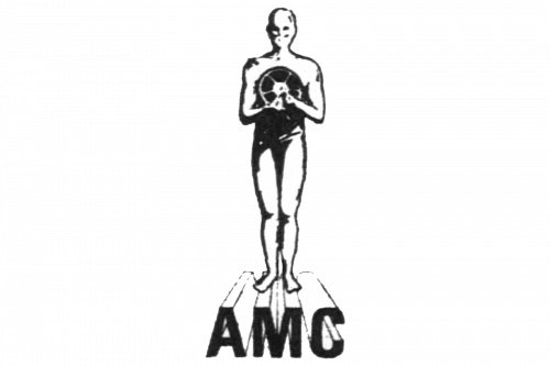
The first-ever proper logo of AMC showed a black-and-white drawing of an Oscar trophy holding a cinema reel in its hands. Both were the accepted symbols for cinema, which justified the choice. Beneath, there was also the ‘ACM’ acronym written in black letters at a perspective.
1973 – 1977
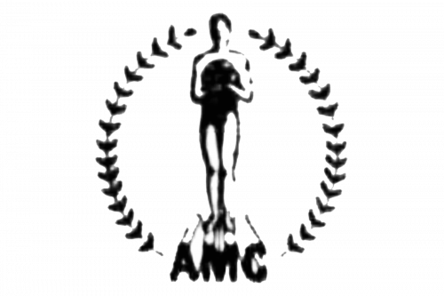
There was one big addition in 1973: there was now a big laurel wreath circumventing the whole composition from the acronym to the statue’s head. Nothing else changed significantly.
1977 – 1979
In 1977, they decided to simply adopt the acronym as the main logotype. There were big white letters written in an ordinary sans-serif font. There was a big shade (or perhaps the side of the letters) cast from the writing to the bottom right corner.
1979 -1980
It’s the last logo before the modern design. The acronym him also consisted of white letters, but with a more elegant, uneven serif style. There were many unnecessary line extensions, and one stretched from the letter ‘A’ underneath and into the letter ‘C’, creating a ribbon of sorts that held the company’s full name in black.
1980 – 1994
The AMC Theatres name came out in 1989, along with a new logo. It was a minimalist stylized monogram, executed in black, and placed on a white background. The lowercase letters were executed in an ExtraBold rounded sans-serif, with the letter “A” having its contour open.
1994 – Today
In 1994 all but the color palette of the logo remained untouched. Today we can see the AMC emblem in two variations: red letters on a white background, or white wordmark placed on a solid red circle. This color scheme perfectly reflects the industry of cinema and entertainment and evokes a sense of passion, joy, and energy.


