The tangy and unlike anything else Funyuns crispy onion-flavored snack, though invented back in the 1960s, is now a not-so-popular product of food industry giant Frito-Lay. The brand known in the United States as Funyuns, in Brazil is sold as Cebolitos (“onions” in Portuguese).
Meaning and history
Officially, the Frito-Lay company was formed in 1961, although both of its “components” began their history in 1932. And the first products of the company were chips – both corn chips (Fritos) and potato chips (Lays). However, Frito-Lay was not going to stop there and constantly thought about expanding the range of their products. So, already 8 years after the company was founded, the Funyuns round crunchy snacks with a flavor of onion were launched.
Funyuns Onion Rings from Frito-Lay are the perfect choice for lovers of crunchy and spicy snacks. The pleasant onion flavor combined with the crunchy texture makes these rings essential for fun sit-downs and snacking.
As for the unusual name, Funyuns, it was invented by Jim Albright, a professor at the University of North Texas. The thing is that originally the brand was going to be called OnYums, but this name already turned out to be registered.
What are Funyuns?
Funyuns is the name of an onion-flavored salted snack, produced by the Frito-Lay company. The product was introduced to the market in 1969, and today is still quite popular not only in the United States but in many other countries around the world.
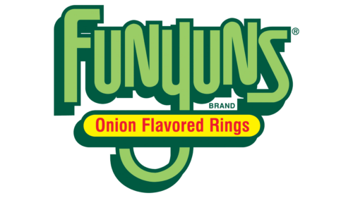
In terms of visual identity, Funyuns is as bright as its name, and as playful as its taste. Since the very beginning of the brand’s history, its logo has been executed in a green and yellow color palette.
1969 – 1987
The original Funyuns logo, designed in 1969, featured a clean and neat lowercase lettering in a modern Sans-serif typeface with slightly narrowed contours of the characters and a curved elongated tail of the “Y”, which crosses the green circle at the bottom. The solid green lettering was set against a plain yellow background with no additional ornaments.
1987 – Today
The redesign of 1987 has made the Funyuns logo a bit more complicated, however, the main principles of the original version, such as composition and color palette, have been kept. The lettering was rewritten in the title case; with two shades of green — the lighter for the bodies, and the darker for the shadowed sides of the voluminous characters. The letters in the inscription are slightly jumping above the line, adding playfulness to the composition. The elongated tail of the “Y” is now crossed by a bright yellow banner with the red “Onion Flavored Rings” explanatory tagline.
Font and color
The bold title case lettering from the primary logo of the Funyuns brand is set in a custom narrowed sans-serif typeface with neat contours of the characters and straight cuts of the bars. It is a hand-drawn logotype in a designer font that has no commercial analogs.
As for the color palette of the Funyuns visual identity, it is based on the combination of yellow and green, with a delicate addition of red. Green stands for success, while yellow is a color of joy, and red — for happiness and love.


