Fujifilm is a legendary Japanese brand of photo equipment and accessories. It was established in 1934 under the name Fuji Photo Film Co. Today is one of the most reputable and powerful companies in the industry.
Meaning and history
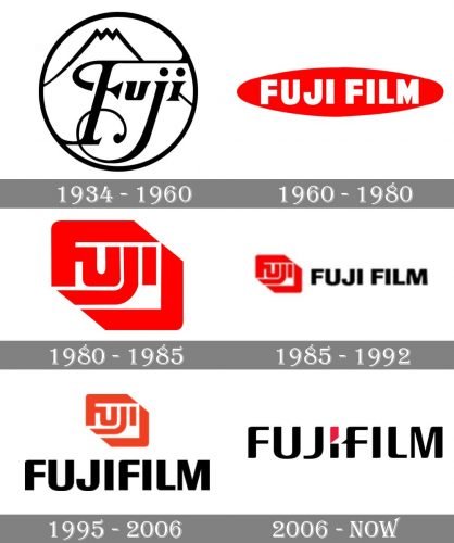
The visual identity of Fujifilm has a pretty intense history with numerous redesigns, which show the brand’s growth and progress. From a delicate and traditional emblem, celebrating patriotism and the name of the brand, to modern bold shapes, which became instantly recognizable across the globe, and finally, its minimalist and stylish logo, which could easily work for any luxury fashion brand.
What is Fujifilm?
Fujifilm is the name of a Japanese corporation, which was established in 1934, and today is considered to be one of the world’s leaders in the production of photography and optics products, consumer electronics, and medical gadgets. During the last decades, the company has been expanding its biotechnology and chemical departments.
1934 — 1960
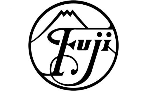
The very first emblem for Fuji was composed of a circular medallion in black and white, with thin lines and very elegant lettering inside. The image on the badge repeated the contours of the Mount Fuji and had an italicized wordmark with the lines of the letters elongated and curved.
1960 — 1980
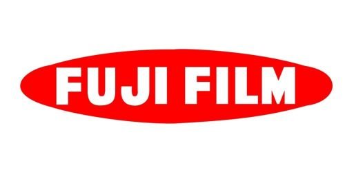
The logo from 1960 featured a horizontally stretched oval in scarlet red with bold white lettering on it. The wordmark in all capitals was executed in a thick sans-serif typeface, which was slightly condensed, but still looked solid and serious. The red and white color combination was a tribute to Japan and the colors of its national flag.
1980 — 1992
A completely new design concept was introduced by the brand in 1980. A custom stylized wordmark in extra-bold sans-serif typeface has its letters placed in one line, but their elongated and curved lines made the whole inscription look diagonal, resembling a camera-eye. This logo had become iconic and still can be seen on some of the company’s products. As for the color palette, there were two options available — red or black on white.
1985 — 1992
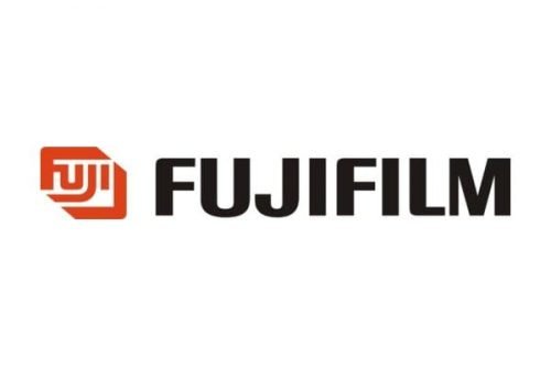
The redesign of 1985 added a j by old black wordmark to the iconic emblem. It was a capitalized inscription in a clean and solid sans-serif with traditional shapes and straight cuts of the letters. The lettering was executed in black, while the emblem in this version had only one color option — red.
1992 — 2006
The contours of the emblem have been refined in 1992, and the wordmark was changed. Now two parts of the company’s name were placed closer to each other, without additional spacing, so “Fujifilm” became one word. The typeface was replaced by a new elegant sans-serif, where outer angles were softened, and inner — traditionally geometric. The logo could be seen in monochrome or red and black, as all previous versions, but one more color combination was added to the brand’s palette — red, white, and green, which looked vivid and energetic.
2006 — Today
The brand adopted a new design concept in 2006. The iconic emblem I was removed from the Fujifilm logo, and now the only color accent was in the upper part of the letter “I”, which comprised two segments, separated by a white triangle. The sleek contemporary logotype has its main version in black and red, but two more options are available — a complete monochrome and white and red lettering on a bright green background.
Font and color
The smooth uppercase logotype from the primary badge of Fujifilm is executed in a modern sans-serif typeface with rounded angles and bold lines. The closest font to the one, used for the Fujifilm insignia is, probably, Kardust TS Condensed Bold, but with most contours modified.
As for the color palette of the Fujifilm visual identity, it is based on a combination of black and red lines, placed over a white background. The powerful and professional color scheme evokes a sense of confidence, progressiveness, and excellence.


