The APC logo looks eye-catching and distinctive due to the original typeface used for the lettering “APC.”
Meaning and history
APC started as the American Power Conversion Corporation at the beginning of the 1980s and was acquired by Schindler Electric in 2007. The acquisition was followed by the official name change of the company to APC by Schindler Electric.
The company, based in Rhode Island, is a very reputable American manufacturer of uninterruptible power supplies and data centers. Although it is always down for an expansion of its activities, today it also provides its customers with servers, software, and consulting services.
What is APC?
APC is an abbreviation, standing for the American Power Conversion Corporation, a company, which has been engaged in the production of power supplies since 1981. The brand is a part of the Schindler Electric family, and serves most of the United States, providing people and companies with data centers, uninterruptible power supplies, software, and related services.
1987 – 1993
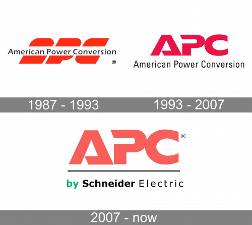
The logo, used by the company from 1987, featured a modern and progressive combination of a stylized graphical abbreviation in solid red, crossed by a black sans-serif lettering with the complete name of the company, set over a narrow white background. The abbreviation had its characters slanted to the right, while the black inscription stood straight and still.
1993 – 2007
The redesign of 1993 has placed the black inscription with the full name of the company under the abbreviation, which has also changed its color and style. The new uppercase “APC” was set in a sharper and more modern sans-serif, set in a darker shade of red, with some smooth ink hues. As for the “American Power Conversion” lettering, its typeface was also switched. Now the inscription was written in a more traditional sans-serif.
2007 – Today
APC was established in 1981. For years, it was known as American Power Conversion Corporation. The name APC by Schneider Electric was adopted following the acquisition by Schneider Electric in 2007.
Emblem
You can break the logo into two parts separated from each other by a long horizontal bar. Above the bar, there is the lettering “APC” in red. While the “C” is more or less regular, the “A” and “P” look unusual. The “A” looks like a triangle with its top corner cut and its lower side unfinished. The unfinished line leaves a dynamic impression – it looks as if the artist is drawing the letter right now.
The “P” also has this unfinished effect to it due to the gap in its upper part. The top end of the letter is diagonal, which makes the design look even more unusual without losing its legibility.
While the upper part of the logo is perfectly legible even at smaller sizes, the same is not true for the lower part.
On a more positive note, the way the lettering “By Schneider Electric” is written reinforces the dynamic feel. It looks like there is a change in speed or power with each of the words. The word “by” looks very powerful and fast due to the vivid color. The lettering “Schneider” looks weaker and slower because, in spite of the same thickness, it features a softer color, gray. “Electric” is even weaker and slower because it is not as bold as its predecessor while featuring the same soft color.
This dynamic is even more perceptible if you take into consideration the heavy, bold, and bright lettering “APC” above.
Colors
The bright, active shade of red is complimented with a gentle touch of green used for the word “by.” The designers decided to color all the other elements gray to make the APC by Schneider Electric logo more serious and refined.


