Frozen is the name of a Disney franchise, which was launched in 2013. Based on a Nobel about two girls, the book grew into a cartoon, which became incredibly popular across the globe. Today Frozen is one of the most successful project children, which has not only printed and cartoon editions but also toys and fashion items produced under its brand.
Meaning and history
The visual identity of the Disney’s franchise, based on the old story by Hans Christian Andersen, keeps the tender and touching the retro mood of the original story, turning it into something modern and happy.
What is Frozen?
Frozen is a Disney franchise, which saw the light in 2013. The famous cartoon is based on a novel by Hans Christian Andersen. Today Frozen is one of the world’s most successful franchises for kids, with a wide range of branded products sold across the globe.
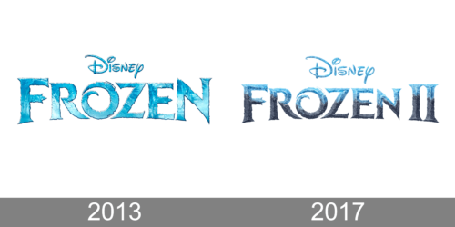
2013
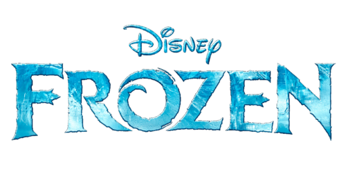
The Frozen logo is composed of a wordmark, which is usually used on its own, but sometimes is placed into an ornate frame with the Disney logotype on top. The lettering of the logo is executed in all capitals with “F” and “N” slightly larger than other letters. The custom typeface of the inscription is based on a bold font with thin delicate serifs and thick straight lines.
The main element of the logotype is the letter “O”, which has its contour open and a bit curved in order to look like a swirl. Another interesting detail about the wordmark are is the uneven edges of the letters, which make it look like a frost pattern on a window or some ice shapes.
The Frozen logo is usually drawn in a white and blue palette, which is the best color representation of winter and cold, but sometimes the company draws it in monochrome, in order to suit more official occasions and complicated backgrounds.
When placed on a medallion, the lettering turns white, while the background features a gradient blue with lots of light blue vignettes placed around its perimeter. The “Disney” inscription is always executed in the same color as the “Frozen” lettering.
2017
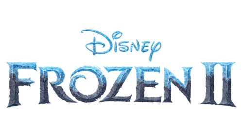
When the second Frozen animated movie was in the works, the world saw an updated logo. it was very similar to the original one with “Disney” printed in smaller font above the larger “Frozen” inscription. The second line got a Roman number two for obvious reasons. The main change, though, was the color of the word “Frozen”. It still had icy blue in the upper half, but the bottom had gray and brown shades, which made it resemble a stone. It is a hint at the Earth Giants, which appear in the second film.
Font and color
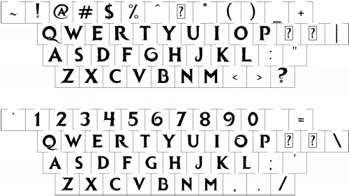
The custom designer lettering from the primary badge of the Frozen franchise is set in bold uppercase characters with sharp angles and uneven contours. The shape of the characters in this inscription looks pretty close to the silhouettes of the glyphs from the Quadrat Serial Bold typeface.
As for the color palette of the Frozen visual identity, it is based on white and light-blue gradients, evoking a sense of cold and freeze, and making the letters look as if they were made of snow and ice.


