Although the logo of France’s top football league, Ligue 1′, is built on the most generic symbol, it has a very distinctive look. How is it possible?
Meaning and history
French Ligue 1, the premier football league in France, was founded in 1932 by the French Football Federation. Initially known as National, it took its current name in 2002. The league’s establishment was a significant step in professionalizing football in France, offering a unified platform for the country’s top football clubs to compete.
Ligue 1’s history is marked by the dominance of several clubs, with AS Saint-Étienne holding the record for the most championships won, closely followed by Paris Saint-Germain (PSG) and Olympique Marseille. The rise of PSG, particularly in the 21st century, marked a new era in the league’s competitiveness, fueled by significant financial investments. Notable achievements include multiple domestic titles and impressive performances in European competitions, solidifying Ligue 1’s status as one of Europe’s top football leagues.
Currently, Ligue 1 continues to be a hub for football talent, renowned for producing world-class players who succeed in both domestic and international arenas. The league’s global appeal has increased with star players like Neymar and Kylian Mbappé gracing its teams. Ligue 1’s current position is not only as a national sports competition but also as a significant player in the global football market, attracting international viewership and investment.
What is French Ligue 1?
French Ligue 1 is a professional football league, recognized as the highest division in French football. It comprises the country’s top football clubs, competing annually to determine the national champion. Ligue 1 is known for its competitive matches, star players, and significant contribution to both French and international football.
2002 – 2008
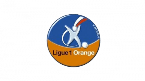
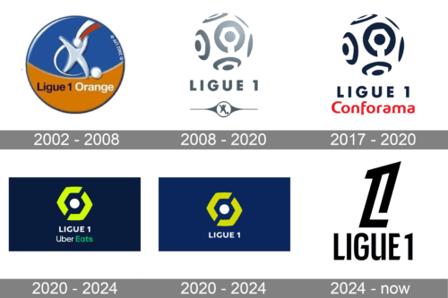
The original League’s logo is a circle colored partially in blue and partially in orange. The lower orange portion hosts the words ‘Ligue 1’ & ‘Orange’ in black and white respectively. The upper blue part depicts a figure of a white person kicking a ball. Lastly, there are two lines of red and white (for the French flag) coming up from behind them.
2008 – 2020
From the very first glance, you may notice that the “ball” seen on the French League 1 logo is far from a regular football. Although you may definitely identify hexagonal shapes on it, they don’t look exactly like the seams on an average football but are rather parts of unusual 3D design elements. They look a bit like hexagonal screw heads with a white gap on one of the sides. Also, while the “football” design does imply a circular shape, there isn’t really a circle outline. The logo features a pictorial “explanation,” a figure of a player who is about to kick a ball.
The choice of color on the old logo, metallic silver, added to the overall futuristic and high tech impression.
2017 – 2020
When in 2017 the European furniture retail chain Conforama signed a title sponsorship deal with Ligue 1, the logo was updated. While all the elements of the old emblem can be seen on the modified French League 1 logo, they are now given in black. The lettering “Conforama” in red was added below the text “Ligue 1”, while the white background of the original emblem became yellow.
2020 – 2024 (Uber Eats)
The 2020 logo is more of a flag. The cloth itself is dark blue, but there is a white circle in the middle and two lime-green brackets surrounding it. These are supposed to be the ball and the field. Directly below them is the name of the League – ‘Ligue 1’ – in capital white characters.
And directly below the name, there’s also the name of the sponsor – ‘Uber Eats’ – in white and green letters.
2020 – 2024
The regular version of the sponsored flag is almost identical, save for the absence of the ‘Uber Eats’ wordmark, as well as the darker shade of blue for the cloth.
2024 – now
The redesign of 2024 has introduced a fully rethought logo for Ligue 1. The new concept is based on a minimalistic approach to design and a laconic black-and-white color palette. The main element of the new badge is a stylized contours digit “1”, which is slightly slanted to the right, enlarged, and placed above the narrowed uppercase “Ligue 1” lettering in a custom sans-serif typeface with diagonal cuts of the lines.


