FreeForm, originally established as a television channel, is now renowned for its broad spectrum of programming ranging from series and movies aimed primarily at teenagers and young adults. The channel is owned by the Walt Disney Television division of The Walt Disney Company. FreeForm is primarily operational in the United States, where it broadcasts a variety of original programs as well as acquired content, catering to a diverse audience with its distinctive mix of teen dramas, superhero shows, and movies.
Meaning and History
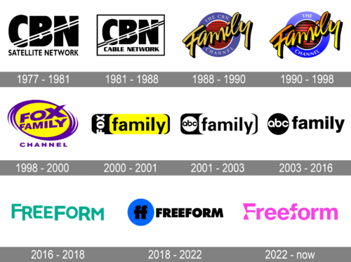
FreeForm was initially founded in 1977 as a religious channel under the name CBN Satellite Service, an extension of Pat Robertson’s Christian Broadcasting Network. It transitioned into the family-oriented entertainment channel, The Family Channel, in 1990 following the move away from religious programming. Over the years, it underwent several rebrandings, becoming Fox Family in 1998 after a sale to News Corporation and Saban Entertainment, and later ABC Family in 2001 when Disney acquired Fox Family Worldwide. Each rebranding reflected shifts in programming strategy and target demographics, aiming to capture a broader young adult audience with a mix of genre programming and original series. FreeForm’s main achievements include the development of popular and critically acclaimed series such as “The Secret Life of the American Teenager,” “Pretty Little Liars,” and more recently, “Grown-ish.” These series have significantly shaped teen and young adult television, contributing to the channel’s reputation as a leader in youth-oriented programming. Today, FreeForm holds a prominent position in American cable television, known for its progressive approach to youth and family entertainment, ensuring its programming remains relevant and engaging for contemporary audiences.
What is FreeForm?
FreeForm is a U.S. television channel that primarily targets young adults and teenagers with a diverse mix of programming. This includes original series, movies, and acquired shows designed to engage and reflect the experiences of younger audiences.
1977 – 1981
This logo presents a stark, monochromatic theme in black and white, projecting a classic yet futuristic appeal. The acronym “CBN” is bold and occupies the primary focus. The “BN” is more linear but shares the same thickness, ensuring visual harmony. A series of parallel diagonal lines cut through the lettering. The full name “SATELLITE NETWORK” is spelled out in a straightforward, sans-serif font below, offering clarity and grounding the otherwise abstract design.
1981 – 1988
Echoing the design of the first, this logo differentiates itself with the addition of the word “CABLE,” signifying a distinct service. The “CBN” retains its prominence and styling, with the encompassing “C” and linear “BN.” The diagonal lines remain, reinforcing the theme of communication and technology. The word “CABLE,” inserted between “CBN” and “NETWORK,” shares the same sans-serif typeface as “NETWORK,” which maintains design consistency and brand continuity.
1988 – 1990
This design breaks from the strict monochrome with a burst of color—a royal blue ring encircles the central motif, featuring the text “THE CBN FAMILY CHANNEL” in a capitalized serif font that conveys trust and reliability. Within the ring, a red-striped backdrop adds depth and a patriotic touch. Overlaying this is the word “FAMILY” in a bold, script-like yellow font, exuding warmth and a personal touch. This logo conveys a sense of tradition and connection, implying content that’s suitable for a family audience.
1990 – 1998
While keeping the overall shape and structure of its predecessor, this logo simplifies the design. The word “FAMILY” is now in a sleeker, more modern script, and the shadow effect adds dimension. The patriotic red-striped background is more pronounced, and the outer ring transitions to a gradient from white to blue, softening the look. This iteration suggests a modernization of values, moving towards a contemporary, yet still family-focused, brand identity.
1998 – 2000
This logo radiates with a vibrant yellow and purple color scheme. The round shape, reminiscent of a spotlight or perhaps the setting sun, provides a backdrop for the bold, capitalized “FOX FAMILY” text, which occupies the central stage in a strong, imposing font with sharp angles that suggest modernity and dynamism. Below, the word “CHANNEL” is set in a smaller, more traditional font, grounding the design. The circular motion lines to the left add a sense of rotation or orbit, reinforcing the idea of a network that revolves around family entertainment.
2000 – 2001
This version of the logo presents a stark contrast to the previous design with its use of high-contrast black and yellow. The “FOX” segment of the logo is encapsulated within a black rectangle, while “family” is displayed in a bold, black, all-caps font with a yellow background that stretches the width of the rectangle, making a strong statement. The design is simple yet effective, relying on the weight of the colors and the balance of the text to convey a sense of stability and presence.
2001 – 2003
This logo is a study of minimalism, employing a simple black-and-white color palette. The “abc” part of the logo uses lowercase letters inside a black circle, conveying accessibility and approachability. In contrast, “family” is written in large, bold, uppercase letters that extend beyond the width of the circle, emphasizing the importance of the channel’s family aspect. This design strikes a balance between being friendly and authoritative.
2003 – 2016
Continuing the theme of the previous design, this logo simplifies the elements even further. It retains the lowercase “abc” within a circular shape but removes any additional embellishments. The word “family” maintains its dominance in bold, uppercase letters, now seamlessly integrated with the “abc” symbol. This design is modern and sleek and conveys a sense of unity between the network and the concept of family.
2016 – 2018
This logo features a buoyant, teal-green color, giving it a fresh and vibrant feel. The font is playful yet composed, with soft edges and flowing curves, giving the logo a casual, laid-back vibe. The name “FREEFORM” is stretched across the length of the logo, with the letters connecting to each other, symbolizing an interconnected yet flexible network, aligning with the network’s branding as non-conformist and open-ended in its programming.
2018 – 2022
A bold, minimalist approach characterizes this logo. A solid blue circle serves as a background for the distinctive “ff” monogram, which is both a part of the word “Freeform” and a standalone symbol. The “ff” is in black, creating a striking contrast against the blue, which could be seen as representing a world or a bubble of creativity. The rest of the “Freeform” text is in black, with clean, sans-serif letters that convey modernity and simplicity.
2022 – Today
The Freeform logo, rendered in a vibrant hot pink, is playful yet innovative, embodying the network’s adaptive and dynamic nature. The two “f” letters stand out with their unique, curvaceous forms that almost seem to spring into action. These unconventional legs not only serve as a testament to the brand’s versatility, aligning with its multipurpose presence across various platforms like streaming and social media, but also suggest a sense of perpetual motion. This emblem, despite being a static image, conveys the essence of movement and the promise of content that evolves with its audience, reflecting the network’s commitment to staying current and engaging. The choice of lowercase lettering adds an element of accessibility, inviting viewers into a space where boundaries are blurred, and expectations are meant to be surpassed.


