Fiat is a famous Italian automobile manufacturer, created in 1899. Today the brand is a part of Fiat-Chrysler Group and is one of the most popular distributors of vehicles all over the globe.
Meaning and history
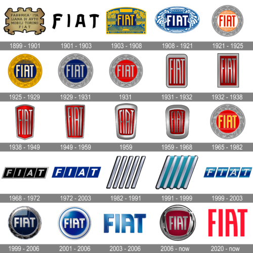
The name of the company, Fiat, is an abbreviation of Fabbrica Italiana di Automobili Torino. It was established at the end of the nineteenth century and is probably on the first place among all the automobile brands by the number of visual identity redesigns.
1899 – 1901
The first Fiat logo was created in 1899 and stayed with the company for two years. It was composed of a gold rectangular with vignettes on its sides and angles and the lettering, saying the whole name of the brand and its shortened, Fiat, version, underneath it.
1901 – 1903
In 1901 the logo was redesigned for the first time and now it was composed of a stylish wordmark in black, executed in a custom typeface with playful elongated lines. The typeface was very dynamic and made the logo look futuristic and eye-catching.
1903 – 1908
The Fiat logo from 1903 was drawn in the Art-Deco style. It was composed of gold lettering, placed on a light blue rectangular, which was located on a dark blue background decorated with gold ornaments.
1908 – 1921
The style and color palette of the logo remained, but the shape of an emblem was changed to a horizontally located oval. Now it looks more universal and the wordmark stands out.
1921 – 1925
The era of the circular Fiat logos began in 1921. The first design was a simple wordmark enclosed in a rounded frame. The monochrome palette made it look confident and powerful.
1925 – 1929
In 1925 the logo became fancier — the framing is now silver with a leaves ornament, and the wordmark is colored red, placed on a white background.
There were slight changes made to the logo during this time period, but they all were mainly about the color scheme.
1929 – 1931
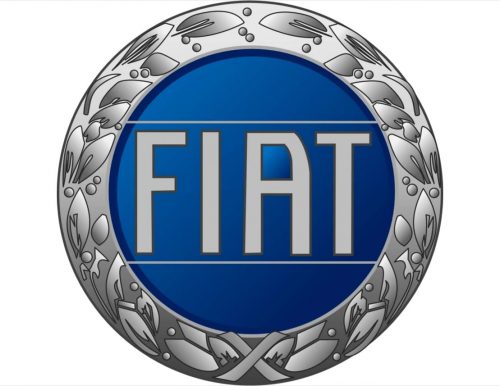
The gold ornate framing of the badge turned silver in 1929. The lettering on a blue background also changed its color to silver, with the new dark gray outline. As for the letters themselves, they became taller and bolder, though were still executed in the same recognizable style.
1931
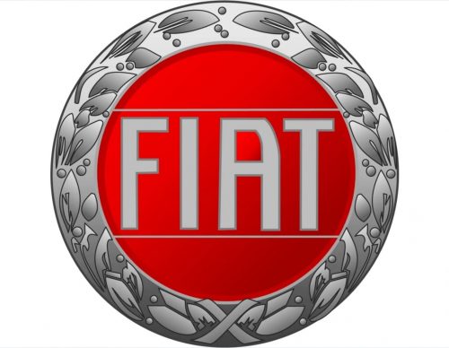
The redesign of 1931 switched the blue color of the Fiat bands background to a bright red, and the light gray or silver lettering started looking fresher and more modern, in a new framing. As for all other elements, including the lines of the letters and the framing — they all remained untouched.
1931 – 1932
A few months later, in 1931 the badge was changed again. This time it was a more radical redesign, with a complete change of the shape. The new Fiat emblem featured a vertically oriented rectangular with rounded corners. The main color was red, while the thick plain frame and letters featured light gray bodies and a thin black outline. The inscription boasted the recognizable Fiat font, but with all letters condenses and elongated.
1932 – 1938
Starting 1932 the brand changed the shape of the logo from circle to rectangular, which is after being modified into a shield-like emblem with a thick silver frame and bold big letter of the wordmark in a custom typeface, located on a red background.
There were about 5 redesigns of the rectangular Fiat logo from 1932 to 1968, but the color palette remained untouched.
1938 – 1949
In 1938 the shape of the Fiat badge was changed again. This time the brand decided to experiment and introduced a crest-like badge with the sharp triangular bottom part and the upper border arched from the center. The narrow red badge looked very elegant in its gray framing with the solid silver lettering in the middle.
1949 – 1959
The badge was redrawn in a more geometric style in 1949. The new shape of the badge was a trapezoid, with the narrow part on the bottom, then a wide one — on top. As for the color palette and the typeface of the wordmark — everything remained unchanged, though the lines of the letters became a bit bolder.
1959
In 1959 Fiat decided to add some softness and style to the badge and emboldened the framing of the red emblem. The new outline looked sleek and chic. It was a very thick silver trapezoid with rounded angles and some gradient shades, which added volume and a three-dimensional feeling to the logo of the Italian automaker.
1959 – 1968
The horizontally striped pattern was added to the red background of the Fiat badge in 1959. As for the framing, its contours were a bit refined and balanced, with the black outline making the badge look more distinctive and confident. The lettering became thinner and darker, to give a more harmonized image with the new shades of the background.
1965 – 1982
In 1965 the company decided to bring back its circular badge from the 1930s, but with some modifications. First of all, the silver framing was refined and drawn in a more minimalist way. Secondly, the lettering was executed in a bright yellow color, with a white outline. And, finally, the redesign background gained more shades and gradients, giving volume and dynamics to the image.
1968 – 1972
A completely new approach to the Fiat visual identity appeared in 1968. The logo became more strict and geometric.
It is now composed of four rectangles, connected to each other. Every letter is placed in a separate cell. The color palette is black and silver, which makes the Fiat logo look elegant and strict.
1972 – 2003
In 1972 the color palette of the logo was changed to blue and white, which made it look lighter and more modern. The Fiat lettering features a bolder sans serif typeface, the clean lines of the letters make the logo bright and remarkable.
The logo stayed with the brand for quite a long time and today is considered to be one of the best versions of the Fiat visual identity designs.
1982 – 1991
The most minimalist badge of the Italian automaking brand was introduced in 1982. The emblem was composed of five thick diagonal lines in gradient silver. And nothing else. The lines were set in parallel to each other, with white spacing, which was twice thicker than the silver elements themselves.
1991 – 1999
The redesign of 1991 added some color to the minimalist Fiat badge and placed its five lines on a calm turquoise parallelogram background. The lines got their ends rounded and now the whole composition looked smoother and more sophisticated, than the previously sharp and progressive badge.
1999 – 2003

The iconic four parallelograms with letters on them came back in 1999. They were still colored blue, but now it was a three-dimensional version of the recognizable badge. The squares became darker and gained gradient shades, while the letters were written in light silver, looking glossy and bright.
1999 – 2006
In 1999 the brand decided to come back to rounded forms. The new Fiat logo is composed of a blue circle with a thick silver frame and silver lettering, which looks volume and vivid due to the use of this color. The logo was used by the company for only one year.
2001 – 2006
After the experiment with a circular logo, the brand decided to bring back the version of 1968, making it three-dimensional and adding some silver tones into its palette.
2003 – 2006

For only three years, starting 2003, Fiat was using a simple yet memorable badge, which was composed of three-dimensional lettering in gradient blue, placed on a plain white background. The letters were executed in a recognizable corporate typeface, but with thicker lines and smooth softened contours.
2006 – Today
Fiat was inspired by the early versions of the emblem and created a silver circle with a red shield inside of it and the silver wordmark.
The gradient colors and three-dimensional effect of the Fiat new logo make the brand’s visual identity sleek and bright.
The elegant elongated letters of the wordmark repeat the typeface created a long time ago, but now it looks cleaner and more stylish.
The Fiat logo is a celebration of an Italian style and a sense of beauty. It is a reflection of the brand’s value of design and quality, its free spirit and its vision.
2020 – Today
The redesign of 2020 kept the original style and typeface from the Fiat emblem created in 2003, though straightened the lines of the letters and elevated the color palette to scarlet-red. The new combination looks more chic and bright, and reflects the brand’s passion and power, accenting its attention to detail and value of beauty.
What is Fiat?
Fiat is the name of the iconic Italian car brand, which has always been one of the most popular European marques of automobiles. Fiat is considered to be a perfect representative of the Italian style and understanding of beauty and comfort.


