 Federal Hockey League Logo PNG
The Federal Hockey League (FHL), a professional ice hockey league, operates primarily in the northeastern United States. Founded and owned by Don Kirnan, the league showcases a range of talent, providing an exciting platform for players and fans alike. Its operational scope extends across various states in the region, offering communities the thrill of professional hockey close to home.
Meaning and history
Established in 2010 by Don Kirnan, the Federal Hockey League embarked on a journey to enrich the hockey landscape. Over the years, it has emerged as a significant player in minor league hockey, known for its competitive spirit and passionate fan base. The league’s main achievements include fostering numerous players who advanced to higher levels and maintaining a steady presence in smaller markets often overlooked by larger leagues. As of 2023, the Federal Hockey League continues to thrive, underlining its commitment to the sport and its unique position in the hockey world.
What is Federal Hockey League?
The Federal Hockey League is a professional ice hockey league, serving as a notable tier in the sport’s hierarchy. It offers a crucial platform for developing talent and engaging communities with the excitement of professional hockey.
2011 — 2015
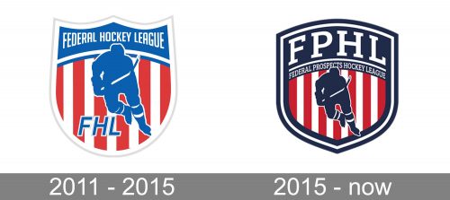
Since its inaugural season in 2010/11, the Federal Hockey League has had two emblems. While they look pretty much the same, there’re quite a few notable differences.
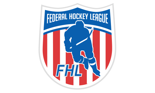
The original Federal Hockey League logo depicted a player over the background of red and white stripes. He was placed inside a shield with three angles on the top. There was the full name of the league on the dark blue background.
2015 — Today
In 2015/16, the FHL logo went through an update. The shades of blue and red grew darker, while the shield grew slightly more rounded. The blue field became bigger and it now housed both the full and the abbreviated names of the league.


