

![]() Fall Out Boy Logo PNG
Fall Out Boy Logo PNG
While the “crowned volcano” is probably the most known Fall Out Boy’s logo, the American rock band also has had other emblems featured on the album covers.
Meaning and history
![]()
The history of the band began in a suburb of Chicago in 2001. Its early days passed in the Chicago’s hardcore punk scene.
2002 — 2003
![]()
The very first version of the Fall about Boy logotype was pretty simple — a bold black inscription in a traditional sans-serif, with no extra space between the three parts of the band’s name, but with the “F”, “O” and “B” slightly bigger than the other capital letters of the wordmark.
2003 — 2005
![]()
The redesign of 2003 made all the letters the same in size, but switched the color palette to bright blue on a white background and separated the words from each other with additional space. The typeface was also changed to a thick and extended sans-serif with geometric contours.
2005 — 2007
![]()
In 2005 the band started using a delicate and fine logotype where all the uppercase letters were executed in a classy and elegant serif typeface. It was a timeless and fine logo, which could perfectly suit any background.
2007 — 2008
![]()
The new Fall Out Boy logo saw the light in 2007. It was still a monochrome inscription, but this time in the lowercase and executed in a handwritten coercive with some lines beautifully elongate and tails slightly curved.
2008 — 2013
![]()
The cursive was replaced by straight shapes again in 2008. The “Fall” and “Boy” parts of the band’s name featured the same style and size — uppercase lettering in a bold sans-serif, while the “Out” between them was written in the lowercase in a lighter font.
2013 — 2016
![]()
The logotype from 2013 featured a slightly narrowed sans-serif inscription with an uneven black texture of the letters. It looked pretty dramatic and eye-catching.
2016 — 2018
![]()
In 2016 the band decided to come back to its logo from 2005, but making the letters a bit condensed and their lines thicker. It looks timeless and elegant.
2018 — Today
![]()
The redesign of 2018 brought a new image to the band. The custom sans-serif typeface with smooth lines and rounded angles looks playful and fun, showing the unique character of the band and their style.
2019 — Today
![]()
In 2019, they renovated their inscription again. It is now bold black letters made in a playful style. Each character is made from the wavy lines, so the whole inscription looks like it is underwater.
The “crowned volcano” symbol
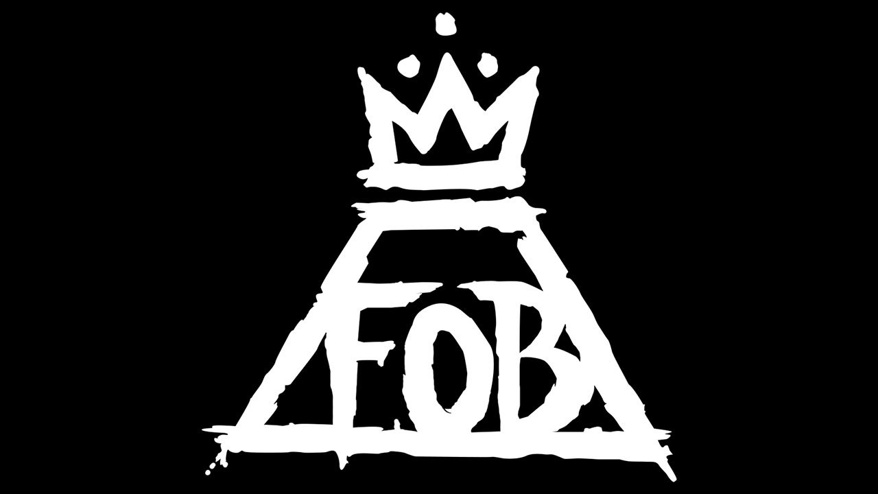
The most popular Fall Out Boy logo can be seen on the cover of the 2013 album Save Rock and Roll. It was created by Tim Beck of Peoria, Illinois who owns world renowned tattoo shop, Freedom Ink Tattoos.
The logo features a triangle with its top corner cut (in other words, a trapezium). Over it, a crown can be seen. Over the central part of the crown, there’re three dots. Inside the trapezium, there’s the lettering “FOB” in large letters. The outlines look uneven as if the image has been drawn with casual strokes of a thick brush.
Now, what about the hidden meaning of the logo?
The trapezium supposedly represents a volcano. In this way, you may create a symbolic link with the song Young Volcanoes. The crown on the top is not just any crown – it has been used to refer to the late artist Jean-Michel Basquiat (1960-1988).
Other emblems
One of the most memorable logos appeared on the cover of the 2005 album From Under the Cork Tree. There was an all-seeing eye in the middle of a keyhole. Around it, a rope could be seen. Above the keyhole, there was a crown, while below it there was a banner housing the name of the band.
![]()
Another popular logo is featured on the cover of the 2017 album Mania. There’s a cross design made up of four right angles. While the band seems to have never given an official explanation, fans believe each of the angles represents one of the band members.
Font
While we can hardly talk about a font in case of the main Fall Out Boy logo, each album cover does feature the name of the band in a distinctive type. Every time, the type is chosen according to the overall design of the cover. The typography may vary from the classic serif type on the cover of the album American Beauty/American Psycho to the friendly sans serif font featured on the cover of Mania.
Colors
![]()
While the palette features just black and white, the combination gets a hint of unique style and mood from the way the two colors are used. Here, black dominates the logo as the background color, while white is used for the emblem itself. However, a reversed color scheme is also possible.


