

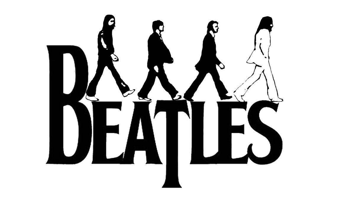
![]() The Beatles Logo PNG
The Beatles Logo PNG
Unlike many modern emblems, the legendary Beatles logo was created in a flash. After all, so many things iconic are often born from mere inspiration without any hard work.
Meaning and history
![]()
One fine spring day in 1963 Ringo Starr and Brian Epstein, the band’s manager, visited the Drum City store in London to find a new drum kit (it was to become Starr’s second kit). The clients wanted the band’s name to be painted on the drum head. The owner of the store, Ivor Arbiter, was away, so the shop assistant called him to discuss the details.
1960
![]()
The very first logo, used by the legendary band, saw the light in 1960, and featured a very futuristic geometric style, with only the inscription, diagonally placed against a dark plain background. The light-blue, gradient lettering featured square shapes of the characters and straight bars, with the tail of the “S” in the “Silver” elongated, complementing the four horizontal lines, crossing the bars at different levels.
1960 – 1962
![]()
Another logo was created for the Beatles in 1960, and stayed in use by the musicians for a couple of years. It was just the name of the band written in black against a white background, but “The” was set in the lowercase, while the “Beatles” had all the letters capitalized. The inscription was executed in a smooth and extra-bold serif font with softened lines, yet very stable characters.
1962 – 1970
![]()
Arbiter, who had never heard neither of The Beatles nor of Starr before, agreed to design the logo. He sketched the emblem on the spot. Now, the logo was to be painted onto the drum head. The band’s fans even managed to find out the name of the person who did this – it was a local sign writer Eddie Stokes. The shop was paid £5 for the job.
Symbol

Probably the most unusual element in The Beatles logo is the letter “T”, which is bigger than it should and has a longer than usual vertical bar. Because of this, the logotype itself is often called the “drop-T” logo. Arbiter mentioned that he had emphasized the “T” with the purpose of making the word “beat” stand out.
How did the “Drop-T” logo become the official emblem?
Interestingly enough, the logo never appeared on any of the original UK albums’ covers. It could only be seen on the drum kits during the concerts. However, the emblem was so easy-to-recognize and unique that it was enough to make it the band’s main logo. It became an official trademark in the 1990s.
Font

In case of a typographic logo, the choice of font is what makes it unique. The creator of the Beatles wordmark did not customize an existing font but created every character from scratch. Today the typeface is called “Bootle”. The name of the band reads cleanly due to the big, solid letters.
![]()
Color
![]()
The only color featured in The Beatles logo is black. Classic and elegant, black in the world of color is very close to what The Beatles are in the world of music.


