![]() AC/DC Logo PNG
AC/DC Logo PNG
Founded in 1973 in Australia, the AC/DC classic hard rock band has made a bang in the history of rock-and-roll music, both in terms of sound and record sales.
Meaning and history
![]()
The AC/DC visual identity history includes three major redesigns and four logo versions created for the legendary band. The iconic symbol, separating two parts of the band’s name was adopted in 1974, inspired by the debut album “High Voltage”, and since then it was present on all emblem except for one, used by AC/DC in 1976.
1974 — 1976
![]()
The very first logo for AC/DC was introduced in 1974 and featured the name of the band written in an extra-bold stylized sans-serif stencil typeface, where the black letters were separated by a sharp yet delicate red lightning bolt. The symbols were placed pretty close to each other, but due to the wide stencils, the whole image looked balanced and fresh.
1976
![]()
The redesign of 1976 changed the color palette of the logo into black and yellow, and the typeface of the inscription to a smooth serif one. The “AC” part was inclined to the right, while the “DC” — to the left. The white lighting bolt between two parts had a double black and yellow outline, which balanced the outline of the arched letters.
1976 — 1977
![]()
The only version of the AC/DC logo with the slash sign replacing the lighting bolt was created in 1976 for the band’s third album, “Dirty Deeds Done Dirt Cheap”. It was a bright pink and black logotype executed in a handwritten sans-serif typeface with its smooth rounded letters in a thick black outline slightly italicized, evoking a sense of motion and energy.
1977 — Today
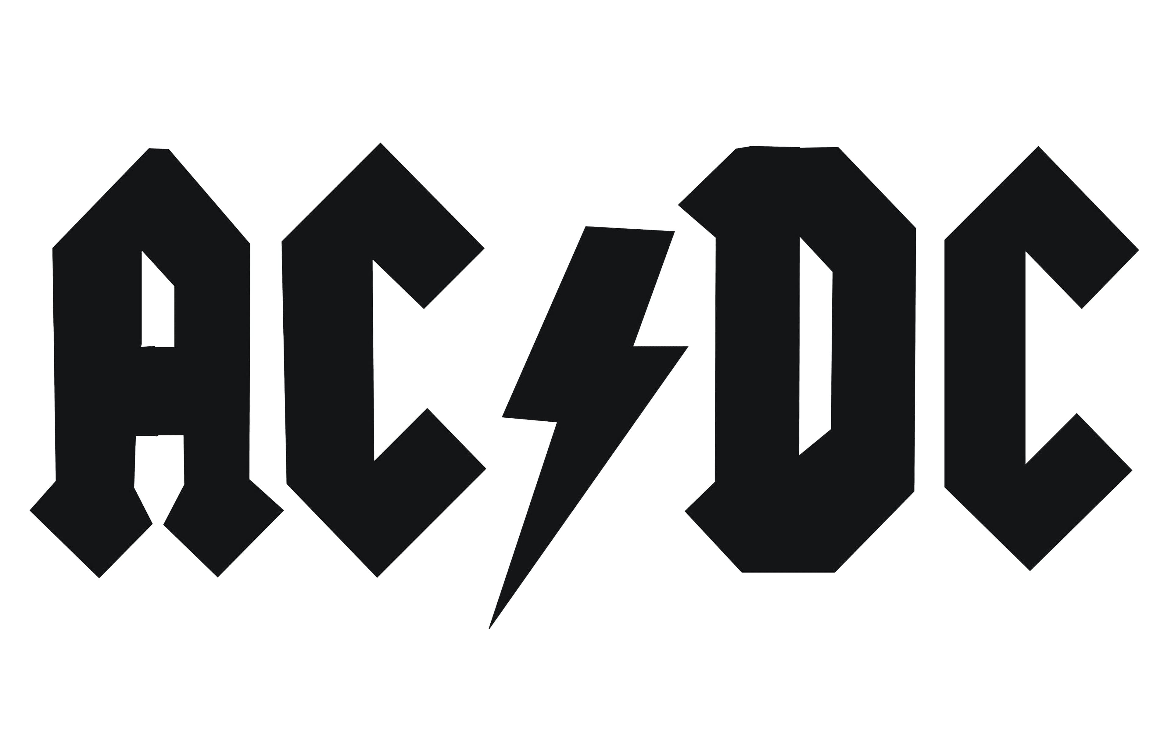
The iconic AC/DC logo we all can see today was designed in 1977 and is still in use by the band. The stylish geometric sans-serif typeface with angular letters and rhombuses at the ends of the letter “A” had a slightly enlarged black lighting bolt separating the two parts of the wordmark. The monochrome color palette of the logo allows placing it on various backgrounds, keeping the powerful and masculine character.
Shape and colors
![]()
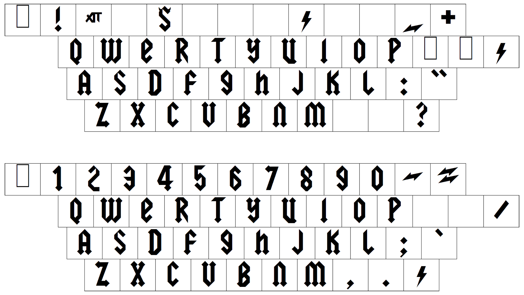
The AC/DC logo uses a Gothic font style, which the designers derived from Gutenberg’s Bible. Huerta insightfully brought the lettering to complement the biblical mood, which pervaded the “Let There Be Rock” album and, particularly, the title. The logo has been around for nearly 40 years and has firmly integrated into the band’s image and concept. The blunt combination of black and white creates an electrifying chemistry of ardor, energy, courage, and perfection. This is actually what the band’s name stands for: “alternate current/direct current.”
Font and color
The heavy lettering from the primary AC/DC logo has already become iconic by today. Its custom gothic-style font with the geometric serifs on the ends of the lines has something in common with such typefaces as Metalista Black and Graveblade Regular.
As for the color palette of the AC/DC visual identity, for most of its history, the band has been using its logo in black, set against a transparent background. The black inscription always looks powerful and brutal, evoking a sense of timelessness and confidence.
Font