F1, or Formula One, is the most popular auto-racing event in the world, which was first held in 1959 and since then organizes two championships per year — for racers and for producers.
Meaning and history
The inception of Formula 1 traces back to 1950, established by the Fédération Internationale de l’Automobile (FIA), marking the beginning of a new era in motorsports. This was not merely the birth of a racing competition but the foundation of what would become a global spectacle, drawing in millions of fans and pushing the boundaries of automotive technology. Over the decades, F1 has been a battleground for legendary teams like Ferrari, McLaren, and Mercedes, each contributing to the rich tapestry of its history through their innovations and rivalries. The sport has witnessed monumental achievements, from the dominance of drivers like Michael Schumacher and Lewis Hamilton to technological milestones that have revolutionized car design and performance.
Currently, Formula 1 stands as a titan in the world of sports, leading not just in motorsport viewership but also in pioneering sustainability within the racing industry. With the introduction of hybrid engines and a commitment to becoming carbon neutral by 2030, F1 is steering towards a future where high-speed racing and environmental responsibility go hand in hand. This continuous evolution keeps the sport at the forefront of technological innovation, commercial success, and global fan engagement.
What is F1?
F1 is the shortened name of one of the most famous sports events in the world, Formula 1. This auto-racing competition takes place twice a year, with the very first event being held in 1959. Today F1 is synonymous with the most prestigious title for any racer.
1985 — 1987
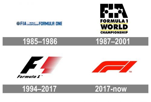
The first F1 logo was composed of a long horizontal rectangular with a wordmark and rounded emblem on its left. The color palette of the original logo was blue on a light gray background, with darker blue and gray for the emblem.
This design of visual identity existed for only two years and was replaced by a brighter one in 1987.
1987 — 1993
The next version of the Formula 1 logo was more compact and confident. It was composed of a black wordmark built-in 3 plants with yellow underline and an FIA lettering above it. The thick black lines of FIA were crossed by a white silhouette of a racing car.
1993 — 2018
The most iconic F1 logo was designed in 1993 by Carter Wong. It was composed of a slanted letter “F” and speed marks, forming “1” in the negative space, on its right.
The color palette of the famous logo was black and red on a white background, where black “F” was symbolizing determination and power, and red of the speed marks — eternal energy, movement, and passion.
2018 — Today
The legendary logo was completely redesigned in 2018. The current F1 visual identity is composed of a bright red stylized “F” leaning forward, like moving into the future, and the diagonal clean line of “1”.
The new logo looks powerful and modern, it can be called minimalist and simple, but the rounded lines are sleek and the dynamics of the logo makes it look alive and energetic.
The bright red is a perfect reflection of the F1 energy and speed. The new Formula One logo is stylish and contemporary, looking great wherever it is placed on and celebrating the race spirit.
Font and Color
The stylized futuristic logo of F1 is set in a designer font with heavy solid bars, straight cuts of the ends, and softened angles. The elongated lines of the uppercase “F” make it unique and this custom font has no commercial analogs.
As for the color palette of the F1 visual identity, it is based on a combination of red and white, which is sometimes accompanied by black elements. Red is the color of power and passion, and these two qualities are the best characteristics not only for the event itself but for everyone taking part in it.
What does the F1 logo mean?
The F1 logo, a masterstroke of branding, symbolizes speed and excitement, capturing the essence of the FIA Formula One World Championship. This iconic design cleverly incorporates the “F1” letters and the number “1” in an invisible space, illustrating the medium’s speed and agility. With this new design, Liberty Media heralded a new era for the sport, aiming to widen its appeal and enhance its status as a premier entertainment brand on the global stage.
Who designed the F1 logo?
The F1 logo redesign was masterminded by the renowned agency Wieden+Kennedy, known for their high regard in the advertising world and their work with a number of brands, including Coca-Cola and Starbucks. This effort was part of a larger rebrand to mark the transition from the Bernie Ecclestone era to a new chapter under Liberty Media’s stewardship. The new branding reflects a commitment to the digital space, engaging with fans through social media and other online platforms.
Is the F1 logo trademarked?
Yes, the F1 logo is trademarked, serving as a key asset in the sport’s global branding and marketing strategy. Since its introduction, the logo has become one of the most recognizable icons in sports, protected rigorously against unauthorized use by third parties. This move ensures that the logo remains synonymous with the high-octane thrill of Grand Prix racing, while its unique design and the incorporation of invisible space keep it distinct in the realm of advertising and commercials. Liberty Media’s announcement of the logo redesign included a comprehensive logo review critique, emphasizing the importance of the logo as a cornerstone of Formula One’s new era.


