Evinrude is the trademark of a legendary American outboards boat motor. Its first manufacturer was the company Evinrude Motors, founded in 1907 by the inventor of the motor, an American engineer of Norvegian origin Ole Evinrude. Later on, Ole sold his first firm and in 1921 with his wife and business partner Bess, he registered a new venture, ELTO Outboard Motor Company. The motors developed by Ole Evinrude were very successful and soon he gained a substantial sector of the US market. In 1929 took place a triple merger of the old and new Evinrude’s companies and their rival Johnson Motors. The new firm later got the famous name Outboard Marine Corporation (OMC). After the bankruptcy of OMC, the Evinrude brand was acquired by Canadian company Bombardier Recreational Products in 2001. Independently of any legal and organizational issues, the Evinrude outboard motor has been steadily developing from the initial tiny 1,5 HP model to the modern giant of 300 HP.
Meaning and history
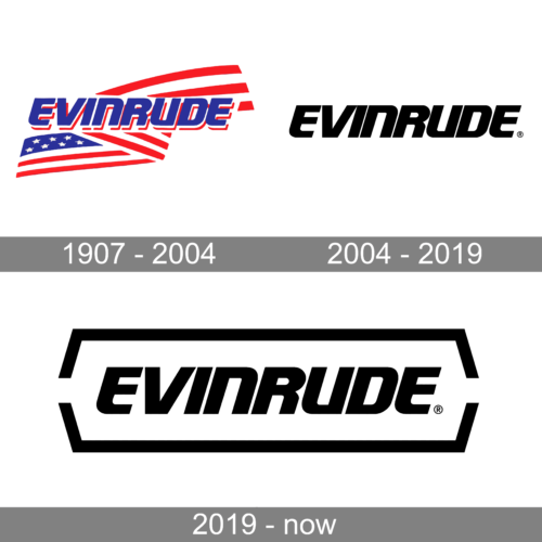
The Evinrude logo was developed at the outset of the motor’s long history and the main design has never sustained any visible changes. The heart of the logo is the brand name “EVINRUDE” written in block letters. The wordmark uses its own corporate font made in heavy industrial style. It looks like the name has been at first cast from metal and then letters have been chopped separately in thick lines and combining sharp and rounded corners. The colour of the wordmark is dark navy blue on a white background or white on the background of the colour used for specific motor type. The meaning, of course, is the last name of the motor’s inventor and the first head of the company Ole Evinrude.
Although the wordmark font and style were never changed, prior to the OMC period, it had a small emblem next to the brand name. It was an oval with three wavy lines inside of the same colour as the wordmark. After its acquisition by the Bombardier company, the motors Got the appropriate abbreviation to the right of the brand name: “BRP” on the image of a gear-wheel.
What is Evinrude?
Evinrude is the same as one of the world’s most famous manufacturers of engines for boats. The company was established in 1918, and by today has gained a worldwide reputation as a super professional reliable brand in its segment.
1907 – 2004
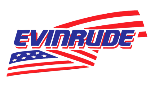
This logo leaves no doubt about the roots of this company even if they just left it at the red, blue, and white color palette. However, the flag of the United States of America serves as a bold background for the company’s name. The latter is printed using a sans-serif font with letters that combine both straight cuts and corners with rounded ones. It resembles Cybertron Bold Italic with some of the corners rounded instead of straight.
2004 – 2019

The company made a perfect font choice from the very beginning. The mere removal of the lines that created a shadow gave the inscription a completely new look and feel. The removal of other background elements as well as the introduction of a black color also played their role. The logo turned out very stylish and could be suitable for any highly-progressive, well-established company.
2019 – now
The changes introduced in 2019 were quite minimal. The most noticeable one was the addition of a frame which consisted of two brackets above and below the name. They created a bolder and more powerful brand image. The wider spacing between the letters enhanced this impression.
Font and color
The bold and sleek lettering from the primary badge of the Evinrude brand is set in a custom futuristic sans-serif font with smooth italicized capitals written in thick black bars with some of the angles softened, and others left sharp. The closest font to the one, used in this insignia, is, probably, Quub Black Italic Rounded, but with most contours modified.
As for the color palette of the Evinrude visual identity, it is set in a timeless combination of black and white, which is a graphical representation of professionalism, excellence, and stability.


