Evian is a French brand of bottled water, created in 1829. The label is a part of Danone and also produces skincare products as well as owns a French spa-resort. Evian is a luxury brand, and is more of a lifestyle, than just water.
Meaning and history
Although the Evian brand of drinking water became world famous only in the late 1970s, when it began to be sold in the most popular and expensive restaurants in Hollywood and New York, becoming the first association with the American elite, the history of this brand began much earlier, namely in 1789.
At that time, Marquis Lesser suffered from diseased kidneys and liver and was treated for his ailments in one of the mineral springs near Lake Geneva. Very soon he noticed that his health had improved considerably. The influential marquis told about the miraculous properties of the water from this spring to all the European elite, and local doctors began to recommend this life-giving water to their patients as a remedy for certain diseases.
A little later, the owner of the Santa Catarina spring fenced it off and began selling the water, and in 1829 the Société des Eaux Minérales was formed as an official water retailer. In the late 1880s, the French Ministry of Health recognized the beneficial properties of this water and gave official approval for its distribution.
However, it was to take almost another hundred years for the spring water to become a brand. Only in the late 1960s it first began to be poured into plastic bottles. And in 1970 Evian brand and the water sold under this brand were bought by Danone Concern. Since then, there are hardly many people left on the planet who have never heard of Evian water.
What is Evian?
Evian is the name of a water brand, which was established in France in 1829.The company bottles the water from the spring, located in Switzerland. From its very beginning until now the brand has been privately owned.
1973 – 1994
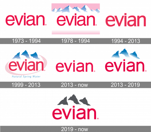
The Evian logo, used but the company from the 1970s to 1990s, featured just a red lowercase lettering in a very elegant sans-serif typeface with traditional contours of the letters. The dot above the “I” featured a square shape.
1978 – 1994
In 1978 another Evian logo saw the light. It was the same inscription, introduced in 1973, but set on a light pink banner with the voluminous image of snowy mountain peaks in white and blue. The red lettering was written over a white background, with the mountains above it, and a light pink part of the banner — beyond.
1994 – 2013
The redesign of 1994 used the logotype from 1973 as the base. The new inscription featured straighter contours of the letters and bolder lines, but the overall style and mood of the badge remained the same.
1999 – 2013
Similar to the current logo, the old one featured three mountain peaks with the wordmark below. The original mountains were blue, and there were pretty prominent clouds around them.
The wordmark featured red sans serif letters. The negative space inside the “a” formed a water drop, which symbolized the product. Also, the strokes had slightly different thicknesses (you could notice it in the “a,” for instance). An ellipse in pastel pink surrounded the design.
Below the wordmark, the lettering “Natural Spring Water” in light blue could be seen.
2013 – Today
The light blue writing and the pink ellipse were gone leaving the logo more minimalist and easier to grasp. The shape of the mountain peaks grew simpler, too, which worked for the same purpose.
The difference in the thickness of the strokes disappeared. The dot above the “i” has moved slightly higher, which made the design lighter.
2013 – 2019
The red lowercase lettering got the mountain graphical addition again in 2013. It was actually the same emblem as on the logo from 1999, but without any framing and outlines. The pink shades were completely removed from the badge, and so was the blue cursive tagline.
2019 – Today
The rocks have grown gray. While the previous versions featured a gradient imitating the clouds, it has now disappeared.
Font and color
The bold lowercase lettering from the primary Evian badge is set in a clean and modern sans-serif typeface with thick yet sophisticated lines and contours of the glyphs. The closest fonts to the one, used in the Evian insignia, are, probably, 210 Namoogothic Bold, Vedo, or Identikal Sans, but with some modifications of the characters’ contours.
As for the color palette of the Evian visual identity, it is based on a smooth and elegant combination of pinkish-red and gray, with a plain white background, creating a bright contrast between the elements. Red here is a symbol of passion, energy, and precision, while gray mountains stand for the quality, confidence, and professionalism of the company.


