 ExxonMobil and several of the companies of this group use Esso as their trading name.
Meaning and history
Esso started as Standard Oil of New Jersey, which appeared after the breakup of Standard Oil.
Esso is a brand name for automotive fuel stations of the Esso Petroleum Co, owned by ExxonMobil, one of the world’s largest gas and oil corporations. Esso was the parent company of the Oil Trust, established by Rockefeller in 1888 in the United States. When the Oil Trust collapsed in 1911, the British Esso Petroleum Co. was acquired by Exxon, which was renamed Standard Oil in 1973.
The history of ExxonMobil begins in 1859 when Edwin Drake and Billy Smith drilled the first successful oil well in Pennsylvania. From that moment the big oil rush began in the United States.In 1870, John Rockefeller and his partner Henry Flagler founded the Standard Oil Company, which in time absorbed more than 90% of the refining industry and more than 30% of oil production in the United States.
The Esso brand was introduced in 1926 as a new type of fuel. In the same year the first mascot of the brand appeared, the tiger, which was depicted on all product labels.
What is Esso?
Esso is the name of a brand, owned by ExxonMobil company, one of the world’s largest and most reputable gas and oil corporations. The Esso brand was launched in 1923, but its history dates back to the 1880s when the Standard Oil company was established.
1880 — 1911

The history of the brand can be traced even further back to the company called the Imperial Oil Company, which worked at the end of the 19th century. This name is reflected in the logo used at the time. It was rather cluttered. In addition to the name, there was also a complicated emblem and rings. The overall shape was a square standing on one of its sharp ends.
1911 — 1923
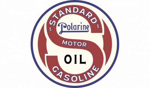
In the era of Standard oil, a totally different logo was used. It was basically a large red “S” inside a black ring with white filling. Behind the “S,” there was a red “O,” which was half-hidden and almost illegible. You can also see the words “Polarine” and “Gasoline.”
1923 — 1934
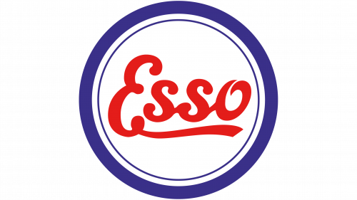
This was when the first real Esso logo appeared. The only thing that was borrowed from the previous version was the ring. This time, it was dark blue and bolder, with a thinner ring going inside it.
In the middle, there was the lettering “Esso” in a stylized cursive script. The extended end of the initial “E” stretched below all the other letters.
There was also a version, where the wordmark was blue, while the outer ring was red.
1934 — 1965
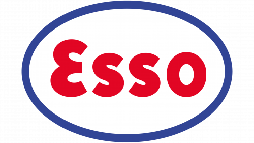
A cleaner and more compact emblem was adopted. The two rings were replaced by a single ellipse. Its border was still dark blue but was thinner than in the previous version. The word “Esso” was now written in a simpler, bold sans. The initial “E,” though, had a slightly unusual shape.
1965 — Today
The oval grew bolder and lighter. The type used for the name of the brand became a bit lighter, too. Other than that, the emblem looks very much like its predecessor.
In addition to the main logo described above, there are also alternative versions, including a 3D version and black-and-white versions.
Font
You can’t say that the letters in the Esso logo come from a specific font unchanged. You can clearly see that they have been adjusted to fit the overall style.
Color
Both the colors in the logo are very bright. The red center is specifically eye-catching – it features the shade that is most widely used in logotypes. The blue is also rather vivid.


