![]() Esquire Logo PNG
Esquire Logo PNG
Esquire is a monthly men’s magazine, first issued in 1933 and published by Hearst Corporation in the USA since 1986. It has over 20 international editions. Esquire defines, reflects and celebrates what it means to be a man in contemporary culture.
Meaning and history
![]()
Esquire is a great example of a magazine that experiments with typefaces and it never feels overdone—it’s always cool, stylish and contemporary.
1933 – 1945
![]()
The very first logo for the famous magazine was introduced in 1933, and already then it featured the style and character of the visual identity we all can see on the covers today. It was a light and elegant handwritten logotype in black, placed on a white background. The letters were set with some space from each other, making the wordmark airy and light.
1945 – 1955
![]()
The redesign of 1945 made the letters of the Esquire logotype bolder and taller. All the symbols were also slightly narrowed and placed closer to each other, but the contours and shapes still resembled the previous version of the magazine’s visual identity.
1956 – 1978
![]()
In 1956 the iconic Esquire inscription got bolder and was extended horizontally, having its massive smooth letters flattened. This was one of the early versions of the logo the magazine uses today. A strong and confident logotype in black brilliantly introduced the character and essence of the editorial.
1978 – 1980
![]()
The redesign of 1978 introduced a very interesting version of the logo, which was completely different from all the previous and following Esquire designs. The uppercase serif inscription in serif typeface was set above the smooth red banner with the white “Fort Nightly” lettering in all capitals on it. The tail of the “Q” was elongated and elegantly curved over the red part of the logo.
1980 – 1993
![]()
In 1980 the magazine comes back to its original style but makes the letters of the logotype more rounded and full. Now the Esquire logotype looks smooth and fancy, but the character of the 1956 logo was a little lost. Though the style was still recognizable.
1993 – 2017
![]()
The redesign of 1993 refined the contours of the logo, making the letters more elegant and modern, and shortening some lines of the letters, creating a modern and sleek feeling. The color palette was still monochrome, the only thing that has never been changed.
2017 – Today
![]()
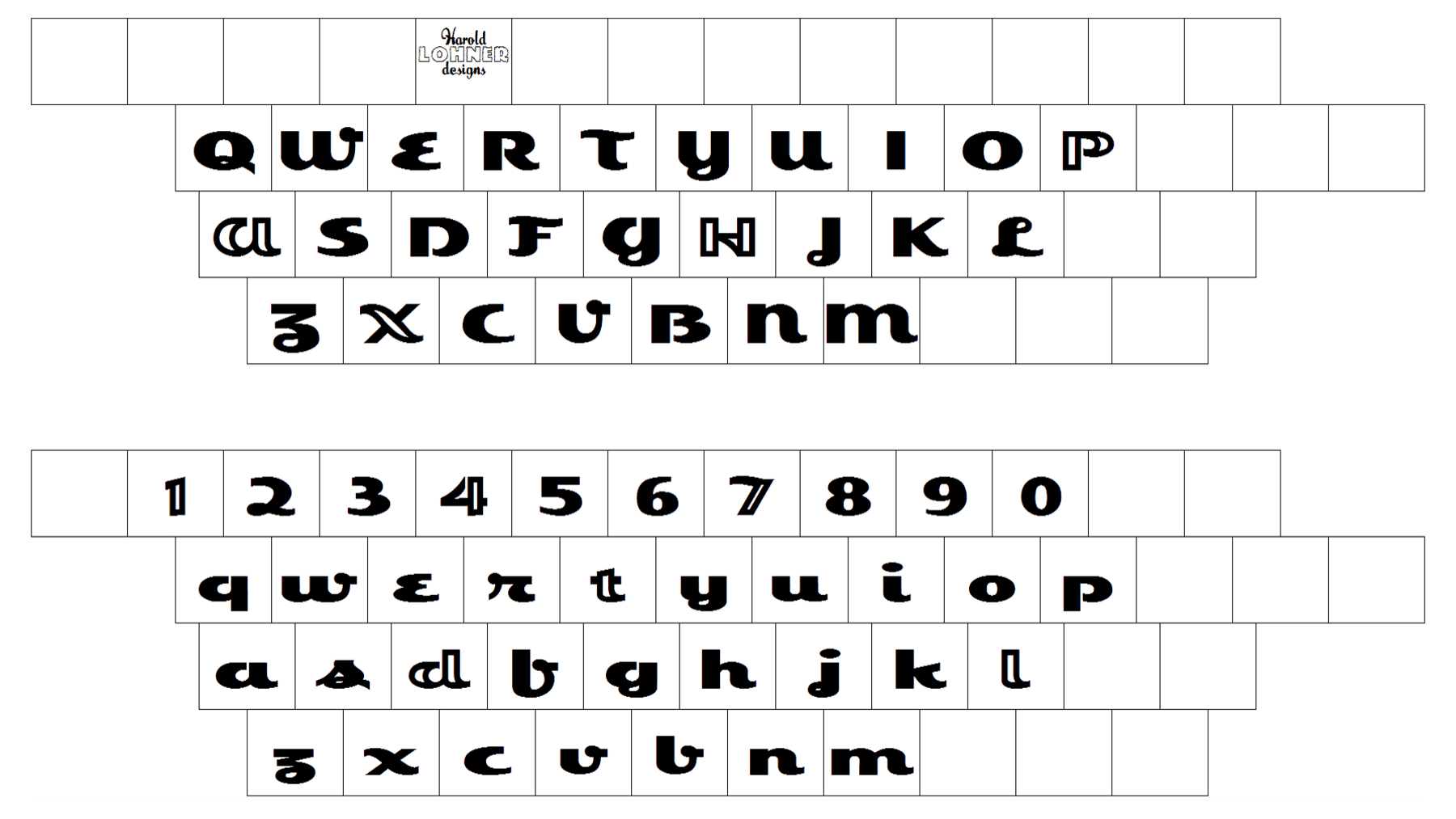
The Esquire logo is the wordmark in the magazine’s famous custom font, which reflects the brand’s style. Typeface Esquivel is a good replica of the original Esquire Logotype.
The brand tries to appeal to a male audience by using monochrome, grey and red. Its logo for a long times used red as its main color, but later the magazine switched to monochrome.
Throughout the magazine, the spreads are balanced with ultra-clean San Serif, notably Brandon or Embauhaus fonts. The publication frequently utilizes Mercury and their custom font Granger for sub-headings.
Font