Vogue is the most famous fashion magazine in the world. It was first published in 1892 as a weekly newspaper and was taken over by Condé Nast Publishers in 1909. It is distributed in 23 countries and has about 11 million of subscribers.
Meaning and history
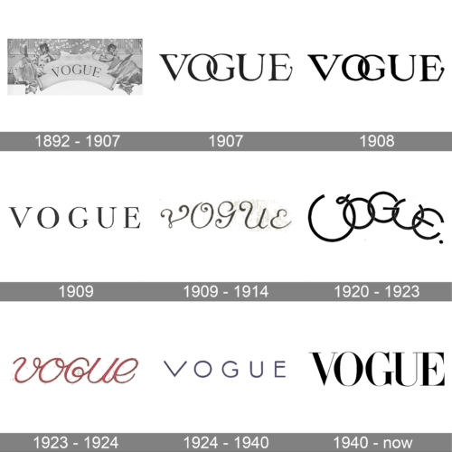
Vogue maintains its position above the masses with singular old-fashioned sophistication. Vogue Magazine’s logo has advanced in recent years, but its look is still based on Didone font styles.
Didone fonts were developed by Firmin Didot, Giambattista Bodoni and Justus Erich Walbaum, whose iconic typefaces, Bodoni, Didot, and Walbaum, remain in use today.
1892 – 1907
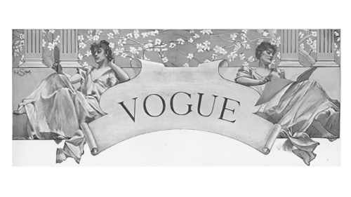
Vogue launched in 1892 as a weekly title for New York high society. A title’s nameplate was not confined to a single typeface. Each issue featured a hand-lettered logo created by the illustrator hired to do the drawing, complimenting the cover’s style.
1907
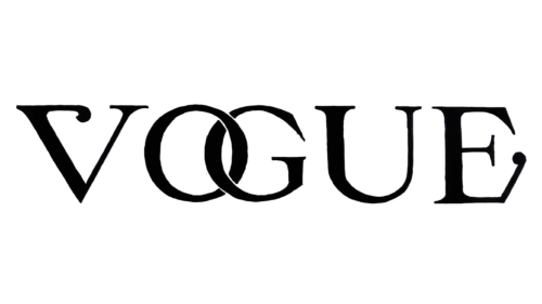
The redesign of 1907 introduced a sharper and more confident badge for the iconic magazine. The new concept was built around heavy serif letters with the uppercase “O” and “G” intertwined. The tails of the “V” and “E” were elongated and slightly curved on the ends. The new logotype was written in a straight horizontal line.
1908
In 1908 the Vogue logo was redesigned again, keeping the concept of the previous badge, but strengthening the composition, emboldening the lines, and cleaning the contours. The new logo was set in plain black on a clean white background. With the thickened lines of the characters, the curves on the ends of the first and last letters became more visible.
1909
By 1909, Condé Nast purchased the magazine, and the cover art became more colorful, theatrical, and abstract. First class illustrators created poster-like images for the covers, working in the Art Deco and Jazz Age styles popular at the time.
1909 – 1914
The redesign of 1909 created a playful yet very feminine logo for the fashion magazine, with the stylized letters featuring elongated curved tails of the bars. The letters slightly varied in size, being smaller in the beginning and the end, and growing to the center. This trick created a very unique image, making the magazine stand out in the list orbits competitors.
1920s – 1930s
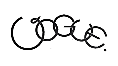
Hand drawn logos remained throughout the 20’s and 30’s. 1932 saw Vogue’s first color photographic cover, shot by Edward Steichen, with a logo rendered in a minimal set of thin white letters. In 1933 the logo is still something the designers play with. The logo styles are still extremely varied.
1923 – 1924
In 1923 the Vogue logo was redesigned again, with the uppercase wordmark set in fancy smooth cursive, in red. This was the only colored version of the badge, ever created for the magazine. The rounded contours and short yet slightly curved tails of the characters created a very delicate and sophisticated image.
1924 – 1940
The new badge, designed for Vogue in 1924, was completely different from the previous version. The new logotype was set in a clean and sharp geometric sans-serif font, with the black medium-weight capital letters placed at a slight distance from each other. This version of the badge stayed with the iconic magazine for more than a decade.
1940 – Today
By 1955, the all uppercase Didot, named for the brothers Pierre and Firmin Didot (highly regarded printers, publishers, typeface designers, inventors and intellectuals working during the 18th and 19th centuries), settled onto the cover of Vogue as a permanent logo.
Current covers also make use of a custom sans-serif font called Vogue AG, created by Terminal Design for Vogue in 2004, which mixes elements of Futura and Avant Garde Gothic.


