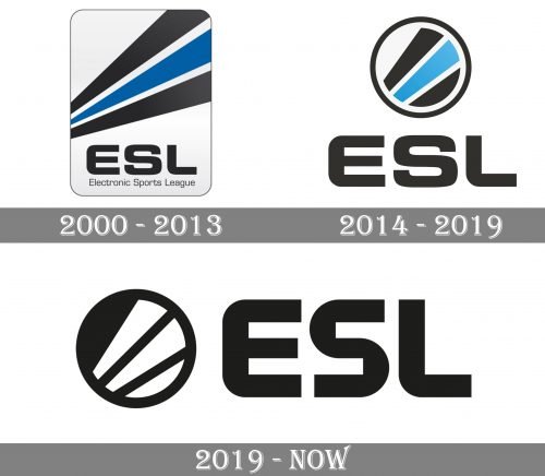
The ESL logo has been very consistent in its core – it has always featured three stripes and the abbreviated name of the company. These elements have survived during the two modifications the design has gone through over its more than 20-year history.
Meaning and history
The Electronic Sports League started working in 2000. Originally, it was an online gaming league and a gaming magazine.
Today, it is known as the world’s largest esports company under the abbreviated name ESL. The company was not created from scratch – it had a predecessor, Deutsche Clanliga, which was established in 1997.
2000
The original logo featured three stripes (black, blue, and again black) stretched from the left to the right. The way the stripes were depicted added some depth as it seemed that they were going forward from the distance.
The large letters “ESL” could be seen below, accompanied by the full name of the company in smaller letters. The design was placed inside a rectangle with rounded corners.
2000s
Several years later, the company decided to adopt a simpler logo. The rectangle with rounded corners disappeared, while the stripes were cut to fit the circle, in which they were now placed. The lettering “ESL” could be seen to the right of the circle. The type remained the same as in the previous logo, while the shade of blue grew somewhat brighter and lighter.
2019
In February 2019, the brand introduced a modified version. While the stripes and the circle are still there, the ESL logo is black-and-white this time. The type is more elongated. The shape of the letters seems almost the same, except for the “S,” which has adopted an unusual touch.


