Evri, previously known as Hermes UK, is a leading delivery and courier service in the United Kingdom. Specializing in cost-effective parcel delivery, both domestically and internationally, it caters to a diverse clientele including businesses and individual customers. Evri’s expansive network ensures reliable and flexible delivery options. The company is a subsidiary of the multinational delivery firm, Hermes Group, which is owned by the German logistics giant, Otto Group. Evri’s market presence is particularly strong in the UK, where it’s a popular choice for e-commerce shipping.
Meaning and history
Evri, originally known as Hermes UK, has a dynamic history reflecting its evolution in the logistics and delivery sector. Founded as a courier service, it emerged as a key player in the UK’s parcel delivery market. Initially focused on serving retail businesses, the company expanded its operations to cater to the growing e-commerce sector, adapting to changing consumer demands and technological advancements.
Significant in Evri’s history is its affiliation with the Otto Group, a global retail and services conglomerate. This connection provided robust financial backing and strategic direction, enabling Hermes UK to scale its operations and enhance its technology infrastructure. The Otto Group’s influence was instrumental in steering the company’s growth trajectory, particularly in the context of the rapidly evolving digital commerce landscape.
As e-commerce flourished, Hermes UK diversified its services, introducing innovative delivery solutions tailored to both businesses and individual consumers. This expansion was not just in services but also in its geographical footprint, reinforcing its position in the UK while extending its reach in international markets.
A pivotal moment in the company’s history was its rebranding to Evri in 2022. This change was more than cosmetic; it represented a strategic shift to better align with modern delivery expectations and environmental sustainability goals. The rebranding was part of a broader transformation, including investment in technology and infrastructure, to improve efficiency and customer experience.
Throughout its journey, Evri has maintained a focus on customer-centric services, adapting its business model to align with market trends and consumer preferences. Despite challenges, including competition and regulatory changes, Evri has sustained its market presence, testament to its adaptability and commitment to service excellence. The company’s history is a story of strategic evolution, responding to market changes and leveraging opportunities in the dynamic logistics and delivery industry.
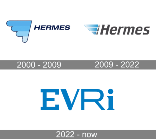
2000 – 2009
The logo displays an abstract blue figure. Adjacent to this graphic is the brand name “HERMES” in a bold, serif typeface, colored in a deep navy blue that complements the lighter blue of the graphic. The simplicity of the design combined with the use of color and negative space conveys a sense of efficiency and precision.
2009 – 2022
The logo depicts the brand name “Hermes” in a sleek, modern sans-serif typeface. The initial ‘H’ is ingeniously integrated with a graphic element comprising several overlaid, ascending blue shapes that create a sense of upward motion or steps. The new design’s use of gradient blue tones and the illusion of dimensionality convey a forward-thinking, dynamic corporate image. It’s a visual leap from the older design, emphasizing progress and innovation.
2022 – Today
The Evri logo presents a stark, clean typeface with uniformity in color, showcasing all letters in a consistent shade of blue. Unlike the previous Hermes logos, which had additional graphic elements, the Evri design is minimalist, focusing solely on the brand name. The ‘E’ and ‘R’ are distinctively styled with right angles and extended lines, adding a subtle geometric touch to the otherwise simple letterforms. This logo represents a significant shift towards a more modern and simplistic brand identity compared to the more detailed and dimensional previous Hermes logos.


