While the logo of Express mail may look pretty abstract, it has been inspired by one of the oldest and most recognized symbols of speed and travel, the wings.
Meaning and history
EMS, or Express Mail Service, is an expedited international delivery service, which operates in the countries of the Universal Postal Union. EMS shipments are delivered exclusively by the air carrier and are handled by priority in both the country of origin and destination, so the average total delivery time for most countries is 7-10 days. According to Universal Postal Union standards, EMS items in the destination country are delivered to the recipient’s address.
Universal Postal Union is an international organization, which was established in Switzerland in the middle of the 1870s, and today consists of 192 countries, with most of the United Nations members also in.
What is EMS?
EMS is an abbreviation, standing for the Express Mail Service, an international cooperative, which operates in more than 190 countries worldwide, providing its customers with expedited delivery of packages.
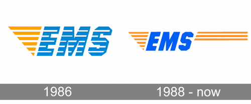
1986
The previous version had the same structure, yet it looked slightly different. Unlike the current logo where the letters are solid, the writing “EMS” in the previous one was formed by stripes in blue and white. The design looked a little lighter, airier than the current one.
1988 – Today
The current EMS logo catches the eye with its vivid, energetic palette combining the color of the orange peel with a clear and bright shade of blue.
The word “EMS” given in a dynamic italicized type forms the center of the emblem. Both to the left and the right, there is a striped design.
To the left of the lettering, there are six orange stripes separated by white gaps. The stripes form a triangle. The triangle apparently symbolizes the wing, which is one of the universal symbols of speed (take, for instance, the wings of Mercury or the winged emblems of numerous car brands).
To the right, there are three orange stripes. While they have the same thickness as the ones on the left, their width is different. The stripes form a rectangle, which can be longer or shorter depending on the space where the logo is placed. For instance, on the official website, the stripes are rather long, so there is a chance to put the following tagline in gray under them: “The international postal express network.” The color of the tagline is semi-transparent, which makes it hardly legible. On the other hand, the tagline is not essential for understanding the logo as the abbreviation “EMS” alone is familiar to the customers all around the globe.
Font
Despite its bold weight, the type featured in the EMS logo does not look exceptionally heavy. This is partly due to the italics. One of the distinctive letters of the font is the “S” – its curves have been replaced by the combination of angles and straight lines.
Company overview
In 1998, the EMS Cooperative was created with the mission of harmonization and development of postal services worldwide. The cooperative is formed by postal-administration members, which provide an international express delivery service operating under a single brand, EMS (Express Mail Service).
Back in 2015, EMS worked in over 190 countries and territories in different corners of the globe.


