ELVO (Hellenic Vehicle Industry) is a prominent Greek automaker, owned by the Greek State. Specializing in commercial, military and civilian vehicle manufacturing, its expansive portfolio testifies to decades of experience. With its main operations based in Thessaloniki, Greece, ELVO holds a significant role in the domestic automotive industry.
Meaning and history
ELVO, or Hellenic Vehicle Industry, established by the Greek Government in 1972, quickly rose as a vital player in the country’s automotive scene. Notable milestones include its military vehicles that earned wide recognition for their durability and design. Currently, ELVO remains a state-owned entity, producing a variety of vehicles while encountering financial challenges.
What is ELVO?
ELVO, or Hellenic Vehicle Industry, is a state-owned Greek company engaged in the production of commercial, military, and civilian vehicles. Based in Thessaloniki, Greece, it is recognized for its range of durable vehicles.
1972 – 1987
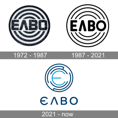
The name of the company is printed using the Greek alphabet, which is not surprising given that it is a Greek automaker. It is done in all uppercase letters featuring bold, rounded strokes and small, pointed serifs. It had a white background that allowed the characters to stand out against a rather bold background. The base consists of multiple, alternating black and white rings. It was a modest and at the same time strong and confident emblem.
1987 – 2021
The updated logo looks more well-designed as the black ring lines were made finer, while the white lines stayed the same thickness. This change alone gave the logo a lighter feel. The font has also been updated and now had no serifs. Instead, all the strokes had rounded ends, which went well with the circular background. The updated logo placed more accent on the name of the company instead of it having to compete with the backdrop.
2021 – now
A modern spin was given to the original emblem. The company continued to use a round emblem as its symbol but used only a few ring lines that were cut in some places and even interconnected in others. It was an interesting geometric pattern. Instead of black, the logo now featured a dark blue, while sky blue was used to print a large, rounded “E” in the center. The full name was still there but now printed under the round emblem. The company did not try to make its logo more internationally friendly and continued to use the Greek version of its name. This fact along with the presence of the round emblem reflected that the company stays true to its roots and values, making it appear as a trustworthy and stable automobile brand.


