Founded in 1988, the Princeton-based ECHL is well-known as a tier below the American Hockey League. The organization used to be referred to as the East Coast Hockey League, which is reflected in one of its older logos.
Meaning and history
The East Coast Hockey League (ECHL) was founded in 1988 by Henry Brabham, a businessman from Virginia. Its inception marked a new era in minor league ice hockey, offering a stepping stone for players aiming to reach the National Hockey League (NHL). Over the years, the ECHL has seen significant growth, both in terms of teams and player development. It started with just five teams but has expanded to include numerous franchises across the United States.
One of the league’s main achievements is its role in nurturing talent. Many players have graduated from the ECHL to the NHL, showcasing the league’s effectiveness as a developmental ground. The ECHL has also been instrumental in the growth of ice hockey in non-traditional markets, contributing to the sport’s increasing popularity in the United States. Currently, the ECHL stands as a crucial component of the professional ice hockey structure in North America. It operates under a tier below the American Hockey League (AHL), continuing to serve as a vital pathway for aspiring hockey players. The league’s sustained success and ability to adapt to changing times solidify its current position as an integral part of the sport’s landscape.
What is East Coast Hockey League?
The East Coast Hockey League (ECHL) is a professional minor league ice hockey organization in the United States. Functioning as a developmental league, it serves as a crucial pathway for players aiming to advance to higher tiers like the American Hockey League (AHL) and the National Hockey League (NHL).
1988 — 1995
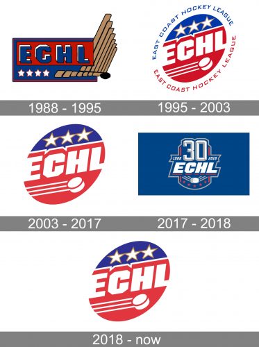
 The original ECHL logo featured the lettering “ECHL” in a rectangular shape with golden “wall” to the right.
1995 — 2003
 The emblem adopted in 1995 looked very much like the current one, except that it comprised the old name of the league and the stars had yellow outlines.
2003 — 2017
2017 — 2018
The redesign of 2017 straighten up the massive white inscription and placed it on a solid blue background, enclosed into a shield-shaped outline in light gray. It was the 30th-anniversary badge, so the “30” was even larger in size than the main logotype, and placed above it in gray and white, looking elegant and voluminous. The bottom part of the crest was embellished with five red five-pointed stars, which were placed under a white hockey puck, set on a chevron, composed of three gray lines.
2018 — Today
In 2018 the badge from 2003 was back again, with almost no changes made, just contours slightly cleaned and strengthened. The use of the logo, designed in 1995, shows the true values of the League and its patriotism, which is more than important for the organization of this kind.


