The essence of eBay’s operations lies at the heart of e-commerce, a digital marketplace pulsating with the activity of buyers and sellers engaging in online transactions. From its humble beginnings to becoming a bastion of online shopping, eBay has revolutionized how goods are bought and sold over the internet. Central to its platform are listings items, where sellers can auction anything from antique treasures to the latest tech gadgets, making it a collector’s paradise and a haven for those looking to find items of all vectors. The platform facilitates an environment where bids are placed in a competitive yet user-friendly interface, ensuring a seamless experience for all parties involved.
Meaning and history
eBay was founded by Pierre Omidyar in September 1995, starting as a simple website called AuctionWeb, from the living room of his San Jose home. This was the seed that sprouted into the e-commerce giant we know today. The company’s name, a shortened form of Echo Bay Technology Group, Omidyar’s consulting firm, reflects its innovative beginnings. The tale of eBay’s growth is punctuated by milestones, such as the introduction of the first employee, which marked the transition from a hobby to a serious business, and the acquisition of PayPal, enhancing online payments’ efficiency and security.
Significant achievements highlight eBay’s journey, including its public listing, the evolution of the eBay logo which is a testament to its dynamic nature, and expansions into various sectors like online auction, online store, and StubHub for event tickets. These developments showcase eBay’s commitment to diversification and innovation.
Currently, eBay stands as a global leader in e-commerce, known for its wide range of offerings from electronics to pez dispensers. The platform’s user-friendly nature, combined with its commitment to secure transactions and intellectual property rights, has earned it global recognition and trust among millions of users. The evolution of the eBay logo design, from its humble beginnings with a basic black text on a white background to the more sophisticated and recognizable logo with its characteristic red, blue, green, and yellow letters, mirrors eBay’s journey from a simple idea to an e-commerce powerhouse.
What is eBay’s logo?
The official badge of the online marketplace eBay is a colorful lowercase lettering in a clean modern sans-serif typeface with the characters placed very close to each other. Each of the letters is set in its color, with the lE” in red, “B” in blue, “A” in yellow, and “Y” in green.
1995 — 1997
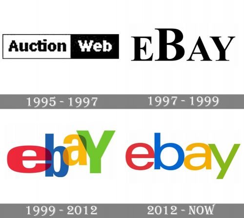
The logo, introduced for AuctionWeb in 1995 was a very simple and usual monochrome badge, composed of a horizontally stretched rectangle with a thin black outline. The left and the wider, part of the badge had a black “Auction” lettering on it, while the right and more narrow part of the emblem was colored black and had “Web” in white written.
The typeface of the wordmark was bold and sans-serif, and in some versions the contours were clean and neat, while on others the structure of the letters was in pixels.
1997 — 1999
The company was renamed to eBay in 1997, and the new logo appeared in the same year. Now it was even a more minimalist logotype, written in black on a white background with no frames or additional details. The inscription was executed in a bold typeface with elongated and distinct serifs and had all the letters capitalized, and the “B” enlarged.
1999 — 2012
The redesign of 1999 brought the iconic colorful emblem to the marketplace. It was a logotype in the lowercase, with the “Y” capitalized. Each letter of the inscription featured its color and was transparent, so the overlapping effect felt stronger. The letters were placed unevenly jumping, and the size and wideness also varied, pointing to the assortment and diversity of items you could find on the website.
2012 — Today
In the fall of 2012, the company unveiled their new logo. It was developed by the US brand consultancy Lippincott, a well-known brand strategy and design company. When announcing the new emblem, the eBay mentioned that it was supposed to symbolize the way the customer experience had changed, the fact that it had become “cleaner, more contemporary, and consistent.”
In what way were these concepts reflected on the logo? To begin with, the glyphs now didn’t overlap. Also, the zigzag effect was gone: the letters were lined up. The shift in the palette and the “Y” only emphasized the more consistent and serious look of the emblem.
The name of the brand included the originally desired name – Echo Bay – and the bitterness of the fact that the domain name was taken. However, since the first days of its operation, this Internet project has been known for its openness and focus on development. The evidence is hidden in its colored letters – each painted in its own color – which make up the logo. And, of course, the constant expansion of the product line.
To sum up, while the first version was highly distinctive, it brought to mind a quirky startup. The updated emblem, in its turn, better fit an established tech company – something the shareholders were probably pleased to see.
Original symbol
When the platform was launched, it didn’t have a real logo. All you could see was a simple lettering “EBAY” in black capital letters (all given in the Times New Roman font).
The same year, it was replaced by a professional logo designed by Elissa Davis from CKS Partners in California. In fact, it was her first project at the company. She colored each of the letters in a bright color and placed them at a different height.
As Davis later recalled, she was inspired by the palette of the Apple logo and the fun movement of the popular game Twister. The overlapping glyphs were supposed to reflect the sense of community characteristic for the platform.
Font
Apart from the first version (which didn’t actually have the status of an official logo), the eBay logo has always been based on the Univers typeface. This fact may surprise you, as, at first glance, the current logo looks in no way like the previous one. That’s because the original logo featured a bolder version of the Univers font, while the current logo sported a thinner one. Also, the capital “Y” of the first wordmark was replaced by a lowercase one.
Colors
The palette has always included four colors: red, green, blue, and yellow. However, the second version of the logo features slightly different, lighter shades.
Can you use the eBay logo?
Since the eBay logo is copyrighted, you can only use it after getting official permission from the copyright holder, the company. After you receive the license for using the badge, you have to follow all the brand guidelines for better visibility of the logo.
Has eBay changed its logo?
Throughout the platform’s history, the eBay logo has been changed three times, with the colorful lowercase concept introduced at the end of the 1990s, and refined in 2012, with no further changes.
When did eBay change its logo?
The very first redesign of eBay’s visual identity was held in 1997 after the name of the platform was changed from Auction Web to eBay. The black serif inscription was changed to colorful overlapping lettering in 1999, and the latest redesign of the badge took place in 2012.


