

![]() DSWD Logo PNG
DSWD Logo PNG
The logo of the Department of Social Welfare and Development (DSWD) successfully reaches two aims at once. For one, it establishes a direct link with the national symbolism, i.e., the Flag of the Philippines. For this purpose, both the colors and the shapes are used. In addition to showing its connection with the government, the DSWD logo clearly represents the organization’s unique mission.
Meaning and history
DSWD is the executive department of the Philippine Government. It was created with the noble mission of protecting the rights of the citizens and promoting social development.
The institution’s history can be traced back to 1915 when the so-called Public Welfare Board was established. The governmental body was responsible for coordinating and operating all the initiatives connected in one way or another with social services.
In 1921, another organization with respective functions was founded, the Bureau of Public Welfare. Officially, it belonged to the Department of Public Instruction. The institution was renamed more than once before it adopted its current name in 1987.
What is DSWD?
DSWD is an abbreviation standing for the Department of Social Welfare and Development, a governmental organization from the Philippines, which was established in 1939 and is focused on the social development and protection of Filipino rights.
Symbol
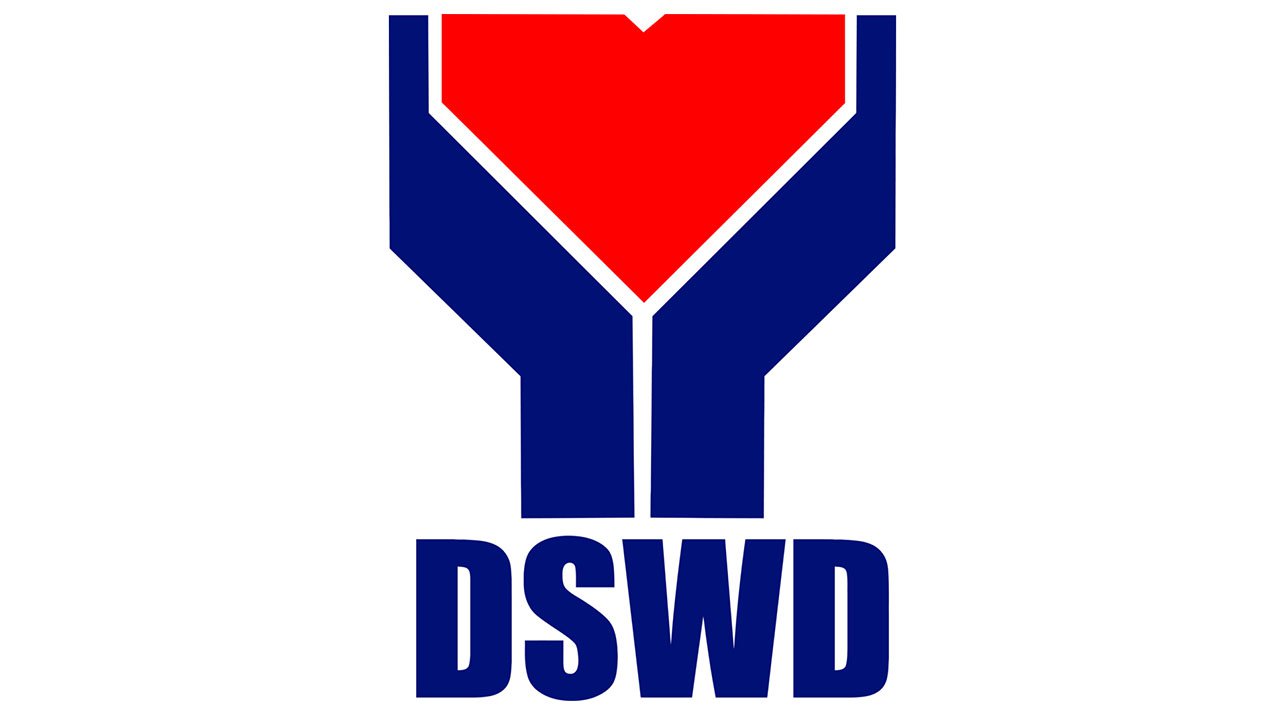
At first glance, you may think that the DSWD logo resembles the plan of a building. It looks like a scheme showing an emergency exit. If you take a closer look, though, you will undoubtedly notice the deeper meaning behind the emblem.
The large red piece dominating the design is a human heart. Because of the angles and small the white detail on the top, it looks somewhat different from a typical heart shape, and yet, it’s still quite recognizable. In this way, the logo shows that people with their personal needs are what makes up the organization’s most important asset.
The heart is being held and protected by two blue hands. The design seems to be a natural representation of the aim that the Department of Social Welfare and Development puts before itself – protecting all the citizens and maximizing their chances. The bright yellow outline adds an optimistic vibe.
While the DSWD seal includes only the emblem, the institution also has a full version of the logo, in which its name is included. The acronym “DSWD” is typically given to the right of the emblem. The dark blue capitals have the same height as the pictorial part of the logo. The glyphs seem to go well with the image not only due to the same size and color but also because of the “rhyming” shape.
Below, the name of the organization is written in full. This time, only the initials are capitalized. For the full name, the designer has chosen a more straightforward sans serif type. The classic proportions and decent breathing space between the letters would have provided excellent legibility if the name of the organization wasn’t that long. However, the dimensions the logo currently has at the website, for instance, don’t give a chance to read the smaller letters. While you can guess or predict what the longer text is all about, you’ll have to make an effort actually to make it out.
Emblem and Flag of the Philippines

Comparing the logo with the national flag can lead you to the conclusion that the designer has deliberately established a clear and strong link between the two images.
What is probably most apparent is the identical color scheme. If you take a closer look, you will notice a couple of structural similarities, too. Try rotating the flag 90 degrees to the right. You will see the sharp angular element between two larger, more extended elements, which corresponds to the heart and the hands of the DSWD symbol. The design also has a couple of similarities with the emblem of Quezon City where it’s based. This is arguably connected with the fact that the Quezon City emblem, in its turn, was inspired by the national flag, too.
Font
![]()
The DSWD logo combines two typefaces. While the one used for the full name of the organization is pretty generic, the larger letters have unique details. Some of the angles are flattened in a way that resembles the top central element on the heart depicted on the primary logo. In this way, the letters and the image merge to create a single whole.
Colors
![]()
Similar to the National Flag of the Philippines, the DSWD logo features two primary colors – red and blue – in combination with bright yellow as an accent color. White has been chosen as the most apparent and perfectly appropriate background, on which these bright and vivid colors perfectly stand out.
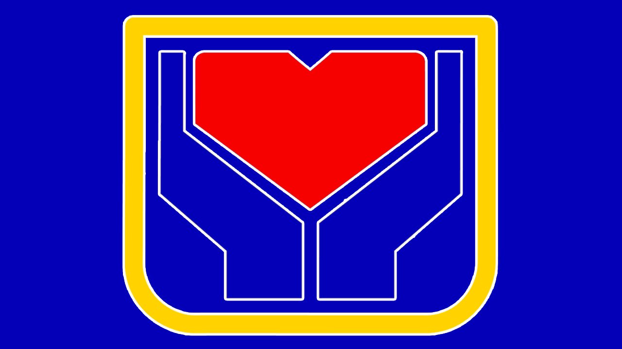
Difference between old and new logo
![]()
While there’s not enough material to trace the whole evolution of the emblem, you can come across the old DSWD seal and compare it to the logo currently displayed on the official website. Although they look pretty much the same, there’s a couple of notable differences. To begin with, the white triangle on the top central part of the heart is more pronounced on the seal. Also, the two lower angles of the yellow outline are more rounded than on the web version of the logo.


