DreamWorks Animation LLC is a California-based animation studio known for its animated feature films, television programs, and online virtual games. Its parent company is Universal Pictures.
Meaning and history

The company was established in 1994, while its first feature film, Antz, was released in 1998.
1998 – 2004
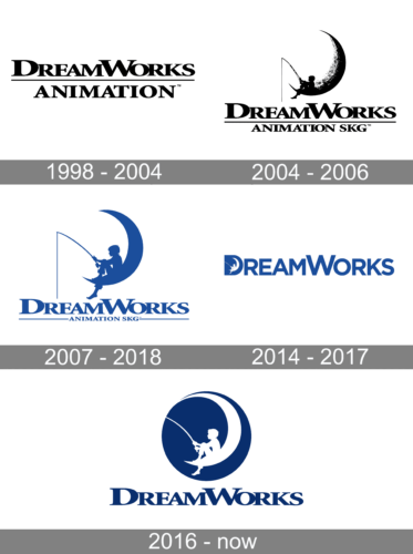
Although the DreamWorks Animation logo has gone through not less than five modifications, there has been something consistent about it. Even if you look at the earliest logo, you will already see the familiar serif typeface with pretty heavy letters. The widths of the strokes forming the letters vary a lot, which creates an elegant and refined style.
In this version, there is nothing but the lettering “DreamWorks Animation” given in two lines. The words are separated from each other by a horizontal line.
2004 – 2006
In 2004, DreamWorks Animation SKG started using an on-screen logo. This was when the legendary emblem appeared featuring a boy sitting on a crescent moon while fishing.
According to the Time magazine, Steven Spielberg, one of the three principal founders, had a long-time idea to make an image of a man fishing from the moon. Illustrator Robert Hunt created several versions. One of them sported a young boy (the illustrator used his son as a model). Spielberg liked this version most of all. A motion version was developed at ILM using computer-generated imagery.
2007 – 2018
The boy became larger in comparison with the previous version. The lettering “Animation SKG,” by contrast, diminished.
2014 – 2017
The redesign of 2014completely changed the composition of the Dreamworks Animation but kept its main elements — the iconic image with the boy fishing on the moon, and the smooth blue and white color palette. In this version, the white drawing was placed on a solid blue letter “D”, and the first letter of the refined inscription, which was set in a heavy and modern sans-serif font. Those were the only two elements of the new logo, with no additional details or underlines. The badge stayed with the company for a bit less than three years.
2016 – Today
The color grew darker, and a dark blue circle appeared on the background. The writing “Animation SKG” disappeared altogether.
Current version
The DreamWorks Animation logo seen on the current website looks pretty much like the 2016 version. Yet, if you take a closer look, you will notice it has been slightly updated. To begin with, the picture inside has grown larger in comparison with the circle. One of the boy’s feet now touches the border, while on the previous emblem, there was some blue space between the foot and the border.
The same can be said about the top part: the moon has become larger, so there is less space between it and the border.
What is not less important is that the boy has been redrawn. If you compare the two versions side-by-side, you will notice that now his position has slightly changed (for instance, his gaze is directed lower than in the 2016 logo).


