DirecTV is the name of the largest and one of the first traditional cable television companies, founded in the United States in 1994. Today the company offers many different services and packages for both cable TV channels, online streaming, and wireless Internet. DirecTV is headquartered in El Segundo, California.
Meaning and history
One of the leaders on the cable television market of the USA. DirectTV is known for the good quality of image and sound, and a great variety of packages available for the users, in different price categories. The company is constantly developing and growing, adopting all the possible innovations to expand its network and the quality of connection so that its users (more than 20 million) would be able to get all the possible content at a high speed.
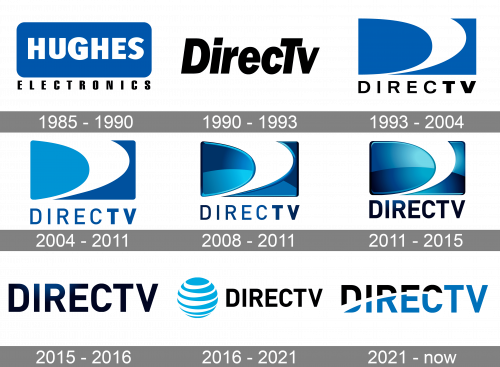
The company was founded in 1985 under the name Hughes Electronics and turned into DirecTV in 1990. The name stayed, but the visual identity has undergone several major redesigns throughout the years.
1985 – 1990
The initial logo of the company was designed for Hughes Electronics in 1985 and featured a horizontally-oriented rectangle with rounded corners, executed in solid blue (a calm deep shade), and containing a white uppercase “Hughes” inscription in an extra-bold sans-serif typeface. The badge was underlined by the black geometric “Electronics” wordmark in all capitals.
1990 – 1993
The first DirecTV logo was introduced in 1990 and featured a very simple concept, consisting of a slanted black logotype in a traditional sans-serif typeface. The badge was designed by Pittard Sullivan studio and can be caller the most modest insignia out of all ever created for DirecTV. This version only stayed in use as the primary one for less than three years.
1993 – 2004
The iconic “D” emblem first appeared on the DirecTV logo in 1993. It was a light blue background with a bold white line fording the letter. The emblem was placed above the uppercase lettering in black, with the “Direc” in medium thickness and “TV” in bold lines.
2004 – 2011
The color palette was slightly refined in 2004. The bottom part of the rectangular background got darker when the upper left one — lighter. Another change was made to the inscription — the typeface got switched to a stricter one with taller letters, and the color of the uppercase logotype was changed from black to medium blue. It all made the badge look more professional and reliable.
2008 – 2011
A three-dimensional version of the DirecTV badge was created in 2008, adding gloss to the surface of the emblem and making the blue gradient. The typeface of the inscription remained the same but the letters got colored in gradients too, and this made them look slightly different from the original version. This badge stayed with the company for almost three years.
2011 – 2015
The contours of the emblem got refined in 2011, with the white solace forming the “D” thinner and more elegant. Due to more blue on the badge, it started looking colder and fresher and got more gloss to its middle part. The lettering gained a darker palette and now all letters were written in lines of the same thickness. As for the typeface, it stayed almost the same as on the previous badge, with just a slight refinement of the contours.
2015 – 2016
The redesign of 2015 simplified the DirecTV insignia to a single logotype, removing the most recognizable blue and white “D” emblem from the logo. The lettering looked exactly the same as on the previous badge in terms of shapes and colors, but got enlarged and now evoked a sense of stability and power. The simplicity of contours was balanced by the boldness and gradient color palette, with all its depth, showing creativity and having a slight mysterious touch.
2016 – 2021
The logotype turned plain black in 2016, and the new graphical element was added to the DirecTV logo. It was a stylized blue and white sphere, with some kind of a spiral pattern, which made it look swirling. The shade of blue used on this version of the logo was lighter than the ones from all previous badges, and in a contrast with black lettering, it was definitely the new eye-catcher. This logo stayed with the brand for quite long — five years.
2021 – Today
The redesign of 2021 brought back the simple logotype with no emblem to the DirecTV badge. This time the inscription is executed in three colors with black on top and blue at the bottom separated by a white arched line, making “TV” solid blue. The letters of the wordmark are perfectly balanced and executed in a strict and modern sans-serif typeface.
Font and color
The uppercase DirecTV logotype is executed in a bold and confident sans-serif font with full-shape letters, clean contours, and distinct cuts. The closes font to the one used in the company’s insignia is, probably, Goldbill Demi Bold, with modern yet pretty minimalist shapes.
As for the color palette, the logo of the company is built around one of the traditional tricolors — blue. Black and white, with black standing for strength and confidence, blue for trustworthiness and professionalism, and white for loyalty and reliability. This is one of the color combinations, which is most often used by technological and telecommunication companies.


