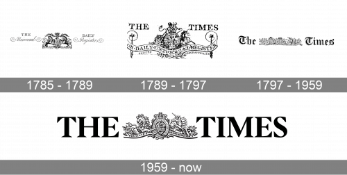
The Times is a British daily newspaper, founded in 1785 by the editor and publisher John Walter I. It was called the Daily Universal Register for the first three years, until it rebranded as The Times in 1788 – the first newspaper in the world to use the Times name.
Meaning and history
The Times is the first newspaper to have borne that name. After it lended it to numerous other papers around the world, such as The Times of India and The New York Times.
The Times is also the originator of the widely used Res New Roman typeface, originally developed by Stanley Morison of The Times in collaboration with the Monotype Corporation. In November 2006 The Times began printing headlines in a new font, Times Modern.
The Times logo consists of the wordmark and The Royal Arms emblem. When John Walter first published the paper on January 1, 1785, he used the royal coat of arms as part of the masthead, because Printing House Square, the site from which the paper was published, had originally been the site of the King’s Printing House.
Current The Times uses the House of Hannover coat of arms, as they were on the throne when the newspaper was founded.
What is The Times?
The Times is one of Britain’s most reliable and prominent daily newspapers, founded in 1785. The Times is currently published by Times Newspapers Limited and is wholly owned by the News Corporation, of which Rupert Murdoch is the head.
1785 – 1789
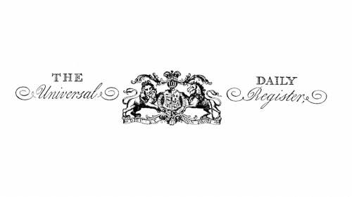
The newspaper, known today as The Times, was established in 1995 under the name The Daily Universal Register, and this name was written on the original badge of the brand, which stayed unchanged for four years. It was a classy and elegant combination of an ornate heraldic emblem with two-leveled lettering written in different styles on the sides of the central image. The emblem on the logo was taken from the Royal Coat of Arms.
1789 – 1797
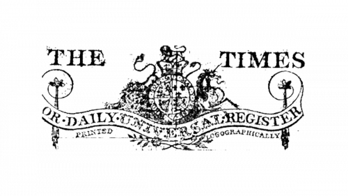
The redesign of 1789 introduced the new name of the newspaper, however, the refined badge also contained the original brand, which was written in the uppercase along the wavy ribbon, drawn in the bottom part of the logo. As for the “The Times” inscription it was set in bold uppercase characters and looked like the main element of the composition.
1797 – 1959
In 1797 The Times logo gets another redesign, with the graphical part horizontally elongated and placed between the two parts of the newspaper’s name, executed in a sleek gothic style with the large letters set in black and white. The new concept has stayed with the newspaper for more than sixty years.
1959 – now
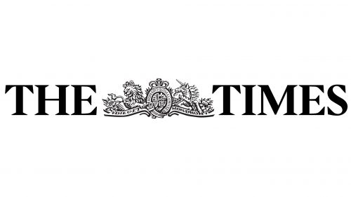
The current version of The Times’ visual identity was introduced in 1959. The concept remained the same — two parts of the enlarged lettering set on the sides from an ornate historical heraldic emblem. Although, the size of the characters and the typeface of the inscription were changed. As for the graphical part, it was also redrawn, simplified, and with all the elements gaining better visibility.
Font and Color
The heavy and stable uppercase lettering from the primary badge of The Times newspaper is set in a classy and elegant serif font with massive triangular serifs on the ends of the characters’ bars. The closest fonts to the one, used in this insignia, are, probably, Acacia Forte Bold, or Romulo SemiBold, with some minor modifications of the contours.
As for the color palette of The Times’ visual identity, it is strict and minimalistic, based on a plain black shade for all elements, and a simple white for the background. This is a classy and timeless color scheme, which represents confidence and professionalism, and always looks actual and strong.


