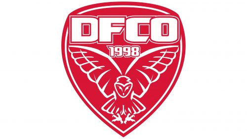
Dijon, also known as Dijon Football Cote d’Or, is a relatively young French football club, which was established in 1998. Based in Dijon, the club was created through a merger of two regional teams.
Meaning and history
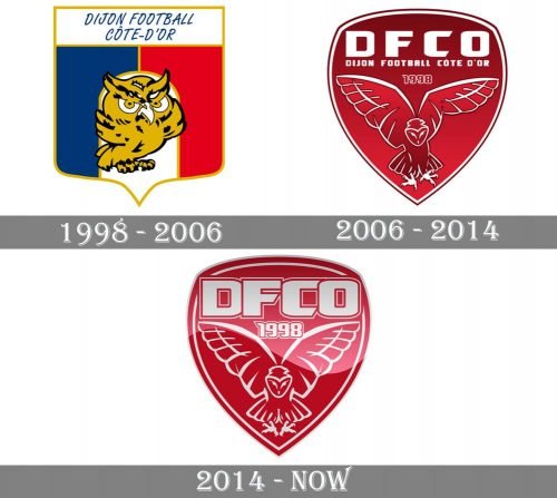
Though the club was established at the end of the 1990s it has already had three official logo designs by today. The first emblem was completely different from what we all can see today, but the main detail remained unchanged — the club’s mascot, an owl, was adopted in the very beginning, as a celebration of the team’s homeland. An owl is the symbol of Dijon and the most famous detail of the local Notre-Dame.
1998 — 2006
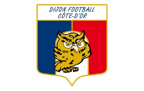
The original version of the logo was designed in 1998 and depicted a cartoonish owl placed on a traditional shield banner. The sleek shield featured three vertical segments in blue, white, and red, the colors of the French national flag.
The upper rectangular part of the shield was colored white and composed light and the delicate italicized wordmark “Dijon Football Cote-D’Or” in all capitals.
The owl on the first logo was drawn pretty detailed, using golden-brown, black, and white colors. Though the image looked more funny than serious.
2006 — 2014
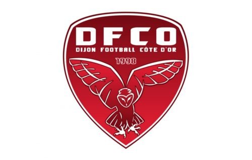
The redesign of 2006 brought a completely new style to the club’s visual identity. The badge was now super modern and strong — a sleek smooth red crest in gradient shades featured a double white and red outline and a stylized image of a flying owl with its wings spread up and to the sides. The custom bold lettering in white was placed on the upper part of the badge, with “DFCO” enlarged and “Dijon Football Cote D’Or” placed under it in small capitals.
The “1998”, a year of the club’s establishment, was placed between the owl and the wordmark, contoured in white and balancing the bird’s image.
2014 — Today
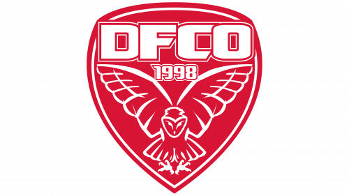
In 2014 the logo was redesigned again. Though now it is fully based on the previous version, it still looks different.
The same red shield in a white outline, but the gradient shade is gone, so the whole image became flat and more modern. Now the logo’s palette consists of only two classic colors — scarlet red and white, and their contrast makes the whole image look powerful and eye-catching.
The contours of the owl were modified and now they are bolder and more confident. As for the wordmark, it was also simplified — the long tagline is now gone, so the only symbols were can see on the club’s shield are “DFCO” in a custom and sharp sans-serif, and bold “1998” in a double white and red outline.
The Dijon visual identity is bright, strong, and not overloaded with detail, though looks intense and stylish. It is a great representation of the team, which is instantly recognizable and looks good on any color of the uniform.


