Digimon is a Japanese media franchise consisting of such elements as a trading card game, virtual pet toys, anime, and more.
Meaning and history
The brand was started in 1997 with several virtual pets similar to the modern Tamagotchi or nano Giga Pet toys.
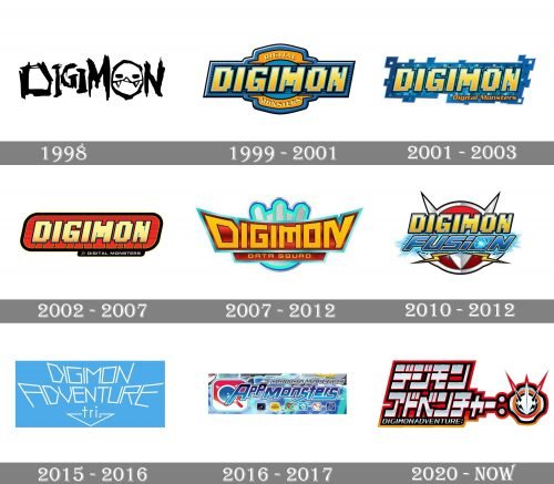
1998
The Digimon logo used for the US release of virtual pets and toys was heavily inspired by the initial American emblem for Tamagotchi.
Also, this logo reflected the meaning of the word “Digimon” (it is short for “Digital Monsters”) without including the full name. The letter “O” was replaced by a monster’s muzzle with three teeth. It looked cute enough, though, to make someone want it as a pet.
On the whole, the wordmark looked as if it had been written by someone who’s not very good at writing yet (a kid or maybe even a monster himself).
1999
Here, the word “Digimon” was accompanied by the explanatory writing “Digital Monsters.” The short name was large, while the explanation was smaller and was arched above and below the main part of the wordmark.
2001
The palette and the style of the letters remained but the designers added a futuristic “digital” touch. It was achieved by adding multiple small squares to the border of the logo (like in an enlarged digital picture).
2002
The squarish “computer” touch remained, although it was now less prominent. The blue background was replaced by the red one. A solid black border appeared.
2007 (Digimon Data Squad)
The fifth anime television series of the franchise showcased a totally different logo. There, the letters weren’t italicized. The proportions of some of the letters were distorted (wide at the top and narrow at the lower part). The tops of the glyphs formed an arch.
2010 (Digimon Fusion)
The old glyphs made up of small squares made a comeback. Now, they had a red and silver shield in the background.
2015 (Adventure tri.)
The lines forming the letters grew extremely thin. They were now white over the blue background.
2016 (Appmonsters)
The glyphs were slightly rounded for a friendlier style.
2020 (Card game)
Some of the elements still resemble the original Digimon logo (for instance, the “cut” corners of the “D,” “G,” and “O”). Yet, this time, the designers added stylish sharp elements and introduced a unique “I” looking like a line cut into two pieces.


