

![]() Smile More Logo PNG
Smile More Logo PNG
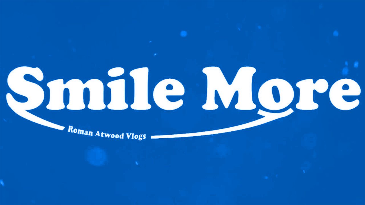
The logo of the Smile More merchandise, which belongs to vlogger Roman Atwood, promotes positivity and good mood.
Meaning and history
![]()
Atwood was born on May 28, 1983, in Millersport, Ohio. He developed an interest in filming and producing videos at high school. The future vlogger started an independent career in 2006. He worked on a variety of projects, including commercials, but it was only in 2010 that he created his YouTube channel Sketch Empire, devoted to comedy.
Atwood has been married twice. He married Shanna Riley in 2001 (divorced in 2008). In 2018, he married Brittney Smith, whom he had been dating since 2008.
He founded the Smile More merchandise in 2013. The online store founded by Atwood sells T-shirts, hoodies, hats, backpacks, bracelets, and phone accessories. You can even find products for babies, blankets, pillows, and things for writing with the “smiling” logotype.
![]()
Symbol
The Smile More logo is primarily a typographical one, although it has a small pictorial detail. The name of the brand is given in a friendly rounded type either in black over the white background or vice versa. While both the words have capitalized initials, all the other letters are lowercased. The “S” and “o” are linked to each other with the help of a long slightly rounded line representing a smile.
Emblem
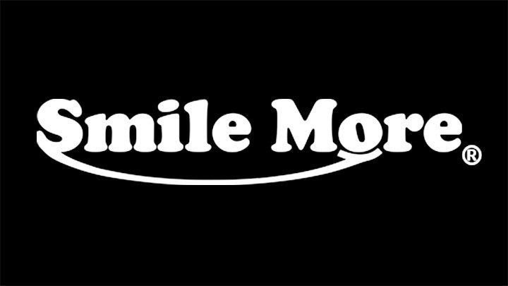
The emblem works even if people see it for the first time in their life and don’t know who Atwood is. Everyone you meet during the day just perceives the positive message the logo conveys and (presumably) gets at least one additional smile. In a way, that’s the effect Atwood’s videos are supposed to produce, too.
Font
The font clearly belongs to the Cooper Black family. It looks pretty close to the following variations: Cooper Black Pro Poster (published by Soft Maker), Cooper Std Black (published by Adobe), and Cooper Black FS Regular (Font Site Inc.).
The history of this font family dates back to 1922. The first type was developed in 1922 by Oswald Cooper as a metal font and was originally released by the Barnhart Brothers & Spindler type foundry. The rounded glyphs have an expressive style. Just take a look at this “dancing” “O”! Also, the type is soft in spite of its weight and the size of its serifs.
Colors
![]()
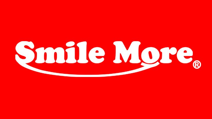
The simple black-and-white color scheme gives Atwood a chance to adapt it to any background. Such adaptability is very beneficial when it comes to placing the Smile More logo on colored items.


