

![]() Despicable Me 4 Logo PNG
Despicable Me 4 Logo PNG
“Despicable Me 4” is the fourth installment in the animated film franchise produced by Illumination Entertainment and distributed by Universal Pictures. The series follows the story of Gru, a former supervillain who adopts three orphaned girls and eventually becomes a caring father and hero. The franchise is known for its humor, engaging characters, and the iconic Minions.
Meaning and History
Initially, “Despicable Me 4” was announced to continue the adventures of Gru, his family, and the Minions. The release date was set for July 3, 2024, and was released without any delays. The “Despicable Me” franchise, which began with the original film released in 2010, has been a significant success for Illumination Entertainment. The success of the original film prompted sequels, including “Despicable Me 2” (2013) and “Despicable Me 3” (2017), as well as the spin-off movie “Minions” (2015) and its sequel, “Minions: The Rise of Gru,” released in 2022.
What is Despicable Me 4?
This is a film that features the continuation of the story of Gru, a supervillain who adopts three orphaned girls and experiences a change of heart, ultimately becoming more of a family man than a villain. The series also introduced the popular Minions, who serve as comic relief and side characters.
2024
![]()
The logo for “Despicable Me 4” features playful, bold fonts with a bright color palette. It incorporates the same font style as the logos for previous versions and the iconic yellow color associated with the Minions. It consists of only the film title. The three-dimensional characters as well as the color reflect the fun and family-friendly nature of the film. The title is split between the two lines, where the second line is significantly larger to make the two lines the same width. The overall look of the logo is vibrant and colorful, reflecting the comedic and adventurous spirit of the film.
Font and Color
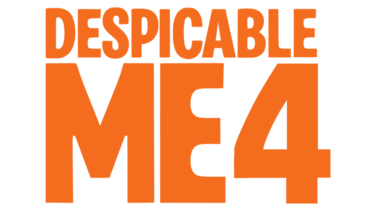
The font chosen for the name has an exaggerated three-dimensional appearance. It features a rather standard font with a straight cut that was modified to make it look unique. This was achieved mainly through the addition of rounded joints on top of the recognizable yellow and 3D characters. It looks like a modified version of the Rude ExtraCondensed Extra Bold font.
The main color in this logo is yellow. In general, yellow can signify happiness, energy, optimism, and creativity. In the realm of film, a yellow logo might convey a lighthearted tone, indicate a comedy or family-friendly film, and suggest a vibrant and lively cinematic experience.


