Der Spiegel is a German weekly magazine, founded in 1947 by John Seymour Chaloner. Today it is has the largest weekly circulation in Europe (840,000 copies). Der Spiegel is mostly famous for its investigative journalism.
Meaning and history
Der Spiegel is a German weekly news and analysis magazine with the highest circulation among German and European weeklies. In 2022 Der Spiegel celebrated its 75th anniversary, and by the covers of the magazine, issued over the years, it is quite possible to study modern history.
The history of Der Spiegel itself began in 1946, when a young journalist Rudolf Augstein received a license to issue a weekly from the British military administration. The American magazine Time was taken as a model for the new edition. At first, the magazine was called Diese Woche (This Week), but then it was renamed Der Spiegel (The Mirror). The first issue under the new title was published on January 4, 1947 – this is the date from which the magazine traces its chronology. The initial circulation of the newspaper amounted to 15000 copies.
From the very beginning of its existence, Der Spiegel gained great importance and popularity, and the circulation of the magazine constantly increased. Thus, in the early 1960s it amounted to 437 thousand copies, and at the end of the decade – already 953 thousand. When the newspaper became available in the former East Germany in 1990, its circulation exceeded one million.
The main secret of Der Spiegel’s popularity is undoubtedly their serious approach to journalism. Back in the late 1940s, the editorial staff adopted a charter that required them to double-check all facts and news published in the magazine. Der Spiegel operates on the principle of critical journalism and publishes a lot of investigative journalism. This approach implies a thorough and lengthy research of the subject of the publication. As a result, the publication has played an important role in uncovering political and economic as well as other scandals.
The popularity of the magazine led to the creation of the Spiegel Online portal, which became the world’s first online news magazine – it was created on October 25, 1994, a day earlier than the online portal of the American Time magazine. In addition to the online magazine, Spiegel TV was created, producing thematic television programs.
These days, Spiegel, like all other print publications, is forced to reduce its paper circulation more and more (it now sells about 500,000 copies), focusing mainly on digital content.
1997 – 2006
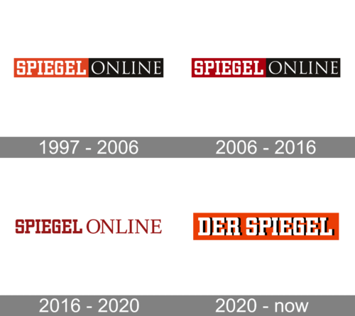
The original logo for Spiegel Online was created in 1997 and stayed with the platform for a bit less than ten years. It was a horizontally stretched rectangular banner divided into red and black halves, with the bold white serif “Spiegel” written across the red part, and the lightweight “Online”, set in a more elegant font, across the black one.
2006 – 2016
The redesign of 2006 has refined the color palette of the Spiegel Online logo, darkening up the red shade, and using a more burgundy tone now. With this new scheme, the badge started looking more confident and serious, evoking a sense of a reputable platform, which provides its readers with only verified information and expert opinions.
2016 – 2020
In 2016 the Spiegel Online logo was redesigned again, keeping both fonts from previous versions, but setting the lettering in burgundy now, and placing it against a plain white background. The only difference in the inscription was the bolder lines of the “Online” part.
2020 – Today
Der Spiegel means “The Mirror” in German and the magazine does its job in reflecting everything happening in the world perfectly.
The magazine’s hard-hitting news approach won it the Europe’s biggest circulation and an abundance of advertisers. It is respected both for its coverage of news and for its concise writing, and it is generally regarded as one of the best news weeklies in Europe.
But for many people the most iconic part of Der Spiegel is its logo. The Der Spiegel white nameplate on a red background has always been hand-lettered but it’s lettering bears a strong resemblance to the City Black typeface designed by Georg Trump in 1930.
Der Spiegel has a custom multi-weight upper and lowercase typeface family (SpiegelSans font), which is being used both in paper magazines and on the Spiegel Online website.


