Decathlon is not only a classic retailer that buys and resells goods. Decathlon started manufacturing and designing its own products back in the 1980s. The founders wanted to set the price themselves to make sporting goods affordable. In addition to the Decathlon brand, the company owns more than 70 of its own labels, each responsible for a different sport. This idea worked well and today the company has over 2,000 stores in 56 countries.
Meaning and history
Decathlon is a French company specializing in the development, production, and retailing of all kinds of sporting goods for more than seventy sports. The company’s first store was opened in July 1976 by Michel Leclerc, a cousin of Gérard Mueller, the founder of Auchan.
The concept was to present under one roof and at the best price products for athletes of all levels, from the beginner to the professional. In 1986 the first store outside France opened in Dortmund, Germany. In 1992 the company entered the Spanish market and in 1999 the British market. In 1999 it entered the U.S. market, but in 2006 announced its withdrawal from the U.S. market and had no operations there as of 2010. Today Decathlon is the leader in the European market of sporting goods. Now it successfully operates more than 1000 stores in 29 countries.
1976 – 1980
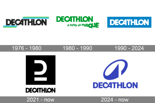
The original logo had the same wordmark appearance as the later designs. The only distinction was the black coloring. Moreover, in this version they put twin stripes of red and blue above and below the wordmark. They stretched from their respective edges towards the letter ‘A’, where they stopped and were cut to fit the letter’s diagonal shape.
1980 – 1990
It was the same wordmark, but repainted bright green. The stripes around it were removed, but there was another element added below the inscription’s right side: ‘a fond la marque’ (French: ‘heart of the brand’). The letters were similar to the ones above, but these gradually increased in size and were rotated all over the place.
1990 – 2024
The word Decathlon is a competition with ten sport events. The brand chose it as the name due to its universality. It reflects all the sport directions, on which the company is focused and is a very strong name.
The Decathlon logo is composed of a wordmark placed on a bright blue rectangular.
The all-caps lettering is executed in a bold and neat typeface, which is similar to Avant Garde Bold. The letters are spaced every close to each other, which makes “D” touch “E” and “L”, “O”, and “N” make a single construction.
The most recognizable part of the Decathlon wordmark is the connection of the letters “C” and “A” which is smooth and rounded.
The white color of the nameplate creates a good contrast with the blue of the background and evoke a sense of energy and happiness.
The Decathlon logo is a reflection of brand’s vitality, generosity and friendliness. It is a strong visual identity, which represent everything, that is important for the company and makes it stand out.
2021 – now (secondary logo)
In 2021 a new logo design for Decathlon was introduced. Today this badge is used as a secondary one, but for a few months, the company has been using it as the main. It is a black-and-white composition with the iconic uppercase lettering in the corporate style set under a massive geometric emblem, which is made of a solid black square with the white underlined letter “D” having its vertical bar erased.
2024 – now
The redesign of 2024 has kept the recognizable logotype of the Decathlon brand but completely changed the emblem. The graphical element, placed above the wordmark is a slanted ellipsoid with the contour cut at the bottom and the left end flared and sharpened to the center. The new emblem resembles a capital letter “D” and evokes a sense of motion and speed. The color palette of the logo was switched from a calming shade of blue to bright blue.
Font and color
The bold uppercase lettering from the primary Decathlon logo is set in a heavy geometric sans-serif typeface, which is based on such famous fonts as Sequel Sans and Neue Plaktrade, but with the letters “C” and “A” connected at the bottom, creating a unique and recognizable element.
As for the color palette of the Decathlon visual identity, it is based on an intense and vivid shade of blue, which stands for confidence, determination, and quality, and makes the customers trust the brand.


