Michaels is the name of an American company, which specializes in the retail of arts and crafts goods. The company was established in 1973 in Illinois, and today it operates across North America through its physical stores and worldwide via the online platform.
Meaning and history
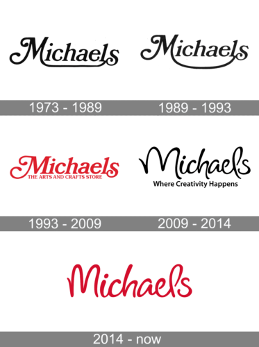
The visual identity of famous arts and crafts distributing company has always been based on a delicate and elegant inscription, which was completely redesigned in 2009, changing the old style mood and curved lines to something modern, yet still smooth and light.
1973 – 1989
The original Michaels logo was introduced in 1973 and boasted light gray lettering with the right vertical bar of the “M” elongated and underlining the whole wordmark. The inscription was executed in a bold old-style serif font with tails of the “M” curved.
1989 – 1993
The updated version did not look much different. There were only a few barely noticeable modifications. The main one was the leg of the “M” that extended under the whole name. It was made rounder and created an inverted arc under the name. This change reflected more freedom and expanding number of stores and a variety of goods sold at Michaels. All the lowercase letters seemed to be shorter compared to the previous version.
1993 – 2009
In 1993 the color of the logotype was changed to intense pink and the tagline was added instead of underline. Now the “Michaels” lettering was slightly italicized and featured even longer curved of “M” and “S”. The “Arts, Crafts & More” tagline was written in the same pink color, but in all capitals and looked more serious and simple, which created a good balance between two parts of the insignia.
2009 – 2014
The logo was redesigned again in 2009 and the completely new style came to the brand. The “Michaels” wordmark was now in black and executed in a modern cursive style, resembling such fonts as Rose Colored Regular and Nora Halim Regular. The “Where Creativity Happens” tagline was written in a title case using a traditional and modest sans-serif typeface, also in black.
2014 – Today
The redesign of 2014 brought back the iconic pink color and removed the tagline. The inscription itself became bolder and slightly narrower than the previous version, which makes it look stronger and more stylish.


