OXXO is the name of a retail chain, established in Mexico at the end of the 1970s. Starting from small groceries, the chain has grown into one of the most well-known retailers in the country, with more than 20 thousand locations, which include convenience stores and gas stations. The company is owned by FEMSA.
Meaning and history
As a chain of convenience stores, OXXO had to have its visual identity bright and eye-catching, so that every person knew it was the spot, where they can find everything necessary. And the company found the solution, using a classic-red and white color palette in all of the emblems, created for OXXO throughout the years. The style changed, but the color scheme remained untouched.
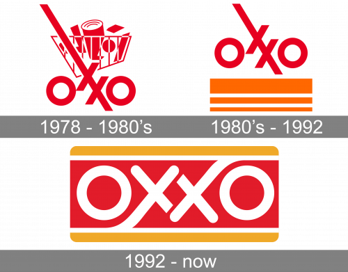
1978 – the 1980s
The very first logo was designed for the retailer in 1978 and stayed in use for several years. It was a stylized geometric wordmark, inscribed into a graphical emblem, depicting a shopping backlit full of various products. All lines and shapes of the badge were executed in one red shade. The wordmark was set in the lowercase, with the bars of both letters “X” elongated. The two “X” were set diagonally one under another, sharing one bar, which was coming from the upper left corner to the bottom right, crossing the shopping basket.
The 1980s – 1992
The logo was first redesigned in the 1980s, keeping the logotype in its style and color palette, but removing the shopping basket drawing. Now it was a more minimalistic badge, where the scarlet-red wordmark was set on a white background and underlined by three orange stripes — a thick one on top, thinner in the middle and the thinned at the bottom.
1992 – Today
Another redesign of the OXXO visual identity was held in 1992 by Carlos Villaseñor Múzquiz, a Mexican designer. The color palette was taken from the previous version, but everything else was changed. Now the logotype set in all capitals is written in stylized white rounded letters over a solid red background, and enclosed into a frame, composed of two horizontally orange lines from top and bottom. The rectangular has its corners rounded, which supports the softened lines of the white inscription. Overall, it is a very balanced and strong badge.


