

![]() Dayton Dragons Logo PNG
Dayton Dragons Logo PNG
The minor league baseball franchise the Dayton Dragons is part of the Midwest League and the Class-A affiliate of the Cincinnati Reds.
![]()
Meaning and history
![]()
The franchise started its history in 1988 in Rockford, Illinois. Originally, the team played as the Rockford Expos. It went through three more names before relocating to Dayton, Ohio, in 2000 and adopting the current brand identity.
Primary symbol
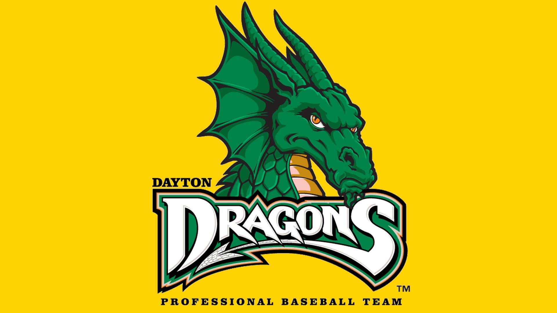
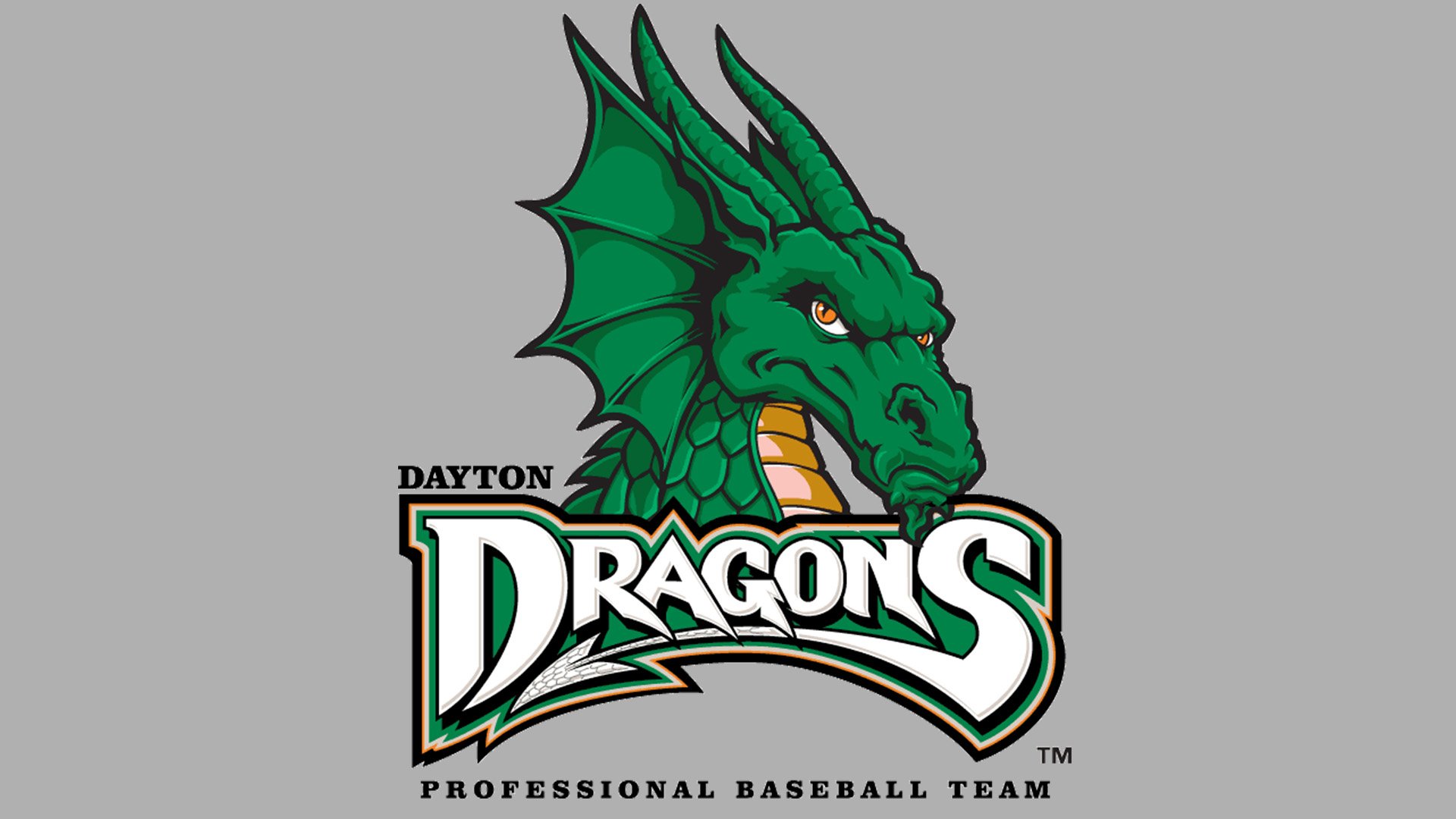
The green dragon seen on the Dayton Dragons logo has orange eyes and chest. The creature has a menacing look on its muzzle. Below, the word “Dragons” in white is placed, while the lettering “Dayton” in black is positioned a bit higher.
Cap emblem
The cap insignia features a large green “D” with a “tail” looking very much like a dragon’s one.
Colors
![]()
In addition to green and several shades of yellow and orange, the logo also sports white and black elements.


