Dax Cars is an automotive company specializing in manufacturing replica sports cars. Dax Cars is known for recreating iconic models such as the AC Cobra. With its headquarters located in England, the company operates globally, catering to enthusiasts and collectors who appreciate the timeless design and exhilarating performance of their handcrafted vehicles.
Meaning and history
Dax Cars is a British automobile manufacturer that was founded in 1968. The company gained recognition for its production of high-quality kit cars and replicas. Dax Cars specializes in replicating iconic sports cars like the AC Cobra. Over the years, the company has built a strong reputation for its attention to detail and craftsmanship. Dax Cars continues to thrive in the automotive industry, providing enthusiasts with exceptional replicas that capture the spirit of classic sports cars.
What is Dax Cars?
Dax Cars is a British company specializing in the production of replica sports cars. They are known for recreating classic designs, offering enthusiasts the opportunity to own and drive iconic models with modern engineering and performance.
Old Logo
A blue round emblem made an association with a trustworthy and reliable company, which proved this impression by earning an excellent reputation. The company name was placed on a white banner that was positioned diagonally across the circle. To add more interest to the emblem, the designers drew two shapes that closely resembled half circles diagonally across the banner with the name, making them blend with the banner. DAX was printed in blue that matched the color of the emblem, but the characters also had a thin white and blue double outline, so the inscription and the logo in general did not look as plain.
New Logo
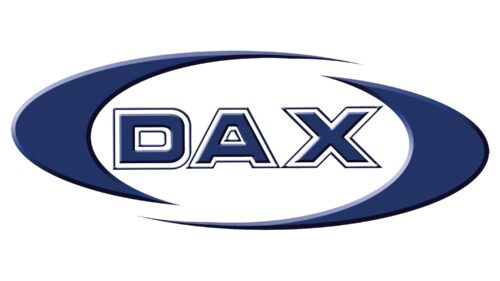
An oval shape replaced the round base. It was not a simple oval shape, though, as designers added a white center and cut it in half diagonally, slightly displacing one of the halves. This created a feeling of movement and reflected the progress and development of the brand. The name was printed using the same sans-serif, a bold typeface that resembled FederationStarfleet or Millenium Bold Extended B. It was placed straight and matched the darker blue shade of the emblem.


