Darracq was a French automobile manufacturer owned by Alexandre Darracq from 1897 to 1938. The company produced a range of vehicles, including cars and motorcycles. Darracq operated primarily in France but also had production facilities in other countries, such as the United Kingdom. Over its four-decade existence, Darracq made significant contributions to the automotive industry, leaving a lasting legacy in the early development of motor vehicles.
Meaning and history
Darracq, founded by Alexandre Darracq in 1896, was a renowned automobile manufacturing company. Its noteworthy achievements include the introduction of innovative production methods, such as assembly-line manufacturing, and the development of high-performance racing cars. Darracq also produced vehicles for the military during World War I. However, due to financial difficulties, the company faced challenges in the 1920s. Today, Darracq is no longer active in the automotive industry, but its legacy lives on through its contribution to automotive innovation and racing heritage.
What is Darracq?
Darracq was a French automobile manufacturer founded in 1896. It was known for producing a range of vehicles, including cars, motorcycles, and commercial vehicles, before it eventually merged with Talbot and Sunbeam to form the Sunbeam-Talbot-Darracq (STD) company.
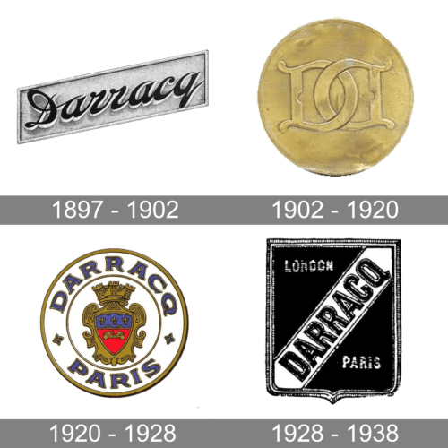
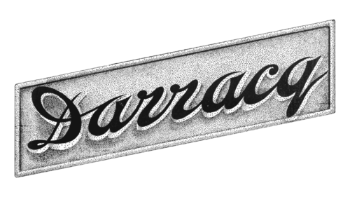
1897 – 1902
The brand name, which is the last name of the founder, is printed using a very stylish, delicate, and elegant typeface. The cursive, handwritten inscription is done in black with a silver shadow that gives it some volume. The name is placed on a diagonal, while a silver parallelogram served as a base. It was simple yet timeless and sophisticated.
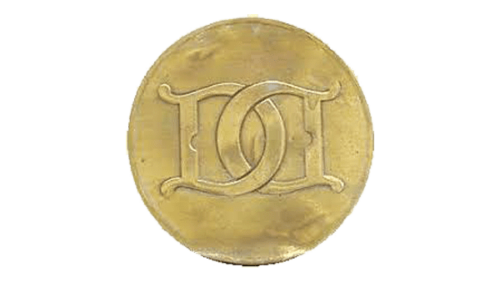
1902 – 1920
This logo is even more luxurious than the original one. It features a golden round plate with a monogram engraved on it. The monogram consisted of two mirrored “D”s that were hooked in the center. This letter stood for the first letter in the brand’s name.
1920 – 1928
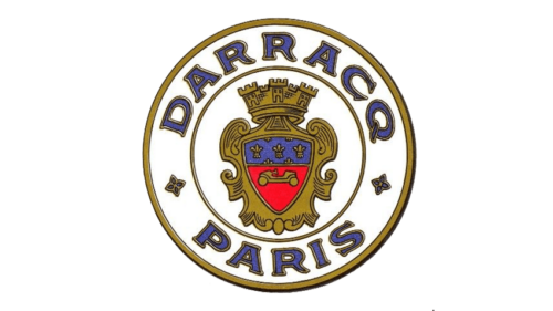
Another exquisite emblem was presented in 1920. It was also round but otherwise looked very different. The center circle was decorated by an ornate shield with a crown on top. It featured royal golden color, which was also used for the border, along with red and blue. The company name was placed at the top of the border, while the location was printed at the bottom. The designers chose a sharp, simple font that went well with the grand look of the emblem. The color of the letters matched the blue and golden used for the shield, creating a cohesive image.
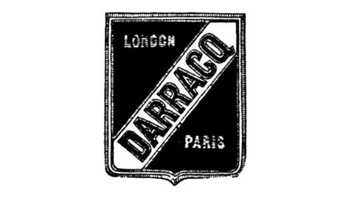
1928 – 1938
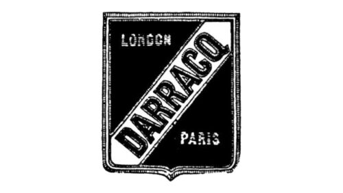
The updated logo also used a shield. It now had a rectangular form with a bit of curved details at the bottom. A textured double border compensated for the lack of elegant details. The dark color of the shield allowed a white banner with the brand name running diagonally across it to stand out. the name was printed using a sans-serif font with thick strokes that enhanced the bold and serious look of the brand. A new location was added to the emblem. In the upper corner, it said “London”, while “Paris” was printed in the opposite corner. The banner and the letters also had a textured outline, which created more interest and gave the characters some volume.


