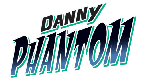
Danny Phantom is an exciting American-Canadian animated television series that first aired in 2003. It tells the story of the life of Danny Fenton, an ordinary high school student who one day accidentally gains supernatural powers and becomes a ghost.
Meaning and history
Danny Phantom is a family animated series about the adventures of an unusual teenager. Danny Fenton has always been an outcast at school, as he is not like the others, although in his heart he is a smart and kind boy with a subtle sense of humor. He believes that any problem should be solved with his mind, not with his fists. One day the teenager was in his father’s laboratory, where something unforeseen happened.
Danny has been given incredible supernatural powers and now he is not just a boy, but a man and a ghost in one person. From now on, he can fly, and become invisible. He can now shoot ectoplasm and occasionally possess people. But being a ghost is not as easy as it seems. Danny must learn to control his powers and balance between living the life of an ordinary teenager and protecting the town from the evil ghosts who are trying to take over.
The series perfectly combines elements of adventure fiction and comedy to create a unique atmosphere. Danny Fenton is a bright and interesting personality, who together with his friends and family fights with dangers and reveals the secrets associated with the world of ghosts.
In addition, the series also deals with important themes such as friendship, love, family, and self-determination. It is a great choice for viewers of all ages who are looking for an exciting and original animated series.
What is Danny Phantom?
Danny Phantom is the name of the animated series, which follows the life of a fourteen-year-old boy named Danny Fenton, who accidentally becomes a half-ghost half-man fighting evil spirits emerging from the “Phantom Zone”. The series was created by Billionfold Studios for Nickelodeon.
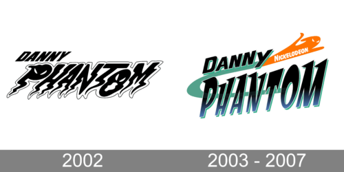
In terms of visual identity, for all three seasons of the Danny Phantom series, o Lu one logo was used. However, the version, which was created for the pilot episode looked quite different.
2002 (Prototype)
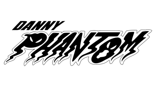
The logo, designed for the Danny Phantom prototype in 2002, featured stylized black-and-white lettering in two levels. The top line of the badge, with the “Danny” inscription, was set in a bold italicized sans-serif typeface with traditional clean contours of the uppercase characters. As for the bottom, the enlarged part with the “Phantom” was hand-drawn, and boasted wavy contours, and elongated bars with pointed ends, which made up the “ghostly” mood and reflected the plot and essence of the series.
2003 – 2007
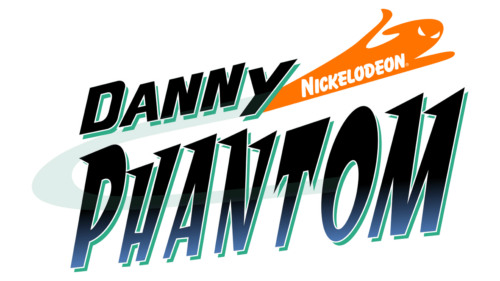
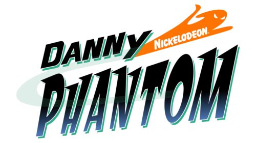
The official Danny Phantom logo was introduced in 2003 and has never been changed since then. The new badge was also based on the lettering and had only one graphical element on it — the orange ghost silhouette with the white “Nickelodeon” wordmark on it. The emblem was coming out from the last letter of the upper level and was moving upright, with its hands spread. As for the main part of the badge, the logotype, it was rewritten in a geometric sans-serif typeface, with clean straight contours of the uppercase characters. The new color of the letters featured black to blue gradients, with the turquoise-green accents on the shadows. The whole composition was decorated by a slightly visible light turquoise orbit.
Font and color
The lettering from the official Danny Phantom logo is set in a custom designer typeface, which doesn’t have many commercial analogies but has something in common with such fonts as Space Cadet Regular, or Neurotic Roman Oblique JNL, but of course, with significant modifications.
As for the color palette of the Danny Phantom visual identity, it’s main color is black, but the bottom line of the inscription features dark blue gradients. Also, a turquoise shade of blue, used in the shadows on the characters, adds recognizability and freshness to the composition, and the orange ghost, apart from being the Nickelodeon signifier, makes the logo look more friendly and fun.


