Curious Pictures is the name of an animation studio, which was established in 1982 and closed in 2014. The studio was known not only for its animation programs and series but also for video games. Curious Pictures also created music videos and advertisements.
Meaning and history
Curious Pictures had two offices, in New York and LA, and was pretty famous and successful. The popularity came to the studio after the release of the A Little Curious animated series, which was broadcast by HBO. Although the company was established in 1982, for the first decade it was known as Broadcast Arts, and the real success came to it after the rebranding.
1982 – 1987
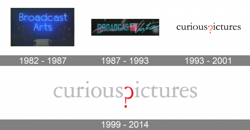
The very first logo of the animation studio was created when the name of the studio was Broadcast Arts. It was a dark blue background with the blue neon lettering in two lines, written in a full-shaped sans-serif typeface over a small writing bureau with the silver-gray typewriting machine on it. There was something very kind and magical in the logo, which was used by the studio for almost five years.
1987 – 1993
The redesign of 1987 changed the concept of the Broadcast Arts visual identity, making it text-based. The lettering was now set in one horizontal line; with the first part set on all capitals of a strict sans-serif typeface, while the “Art” was written in light and delicate cursive and placed slightly diagonally. The two parts of the logotype were separated by a gradient pink square plate with the letter “T” engraved on it.
1993 – 2001
Broadcast Art was renamed Curious Pictures in 1993, and the new logo was introduced in the same year. The new concept, created by Pentagram, was based on the black lowercase logotype in an elegant serif typeface, with the letter “P” replaced by the red question mark. It was an extremely stylish and unique logo, which evoked a sense of curiosity, elegance, and high quality of a product. The badge stayed untouched for more than seven years.
1999 – 2014
In 1999 the studio decides to slightly change the badge, keeping the Pentagram concept and style, but playing with the colors. The main shade was now light gray, while the question mark remained in the red. It was made solely for placing the logo on a solid black background, so the black, red, and light gray or white tricolor was used by the studio till 2014 when the company ceased all operations.


