While the origins of the Crystal Palace Football Club can be traced to 1985, it was officially founded in 1905 at the famous Crystal Palace Exhibition building in Selhurst, London.
Meaning and history
Crystal Palace Football Club, a prominent English professional football club, was founded in 1905. The club’s inception is deeply rooted in the historic Crystal Palace Exhibition building, which inspired its name. Over the years, Crystal Palace has carved out a significant presence in English football, particularly known for its vibrant and passionate fan base.
Central to Crystal Palace’s footballing journey have been its key achievements. The club has spent several seasons in the top tier of English football, competing in the Premier League. Notably, Crystal Palace reached the FA Cup final twice, in 1990 and 2016, showcasing their ability to compete against the nation’s best. Their reputation for resilience and competitiveness is well-earned, often punching above their perceived weight in the competitive English football landscape.
Currently, Crystal Palace holds a respectable position within the Premier League, continually striving to consolidate its status among England’s footballing elite. The club, with its base at Selhurst Park in South London, continues to evolve, building on its rich history and looking towards a future of sustained success and growth in English football.
What is Crystal Palace?
Crystal Palace is the name of the British football club, which was established at the beginning of the 20th century. For the most part of its history, the club was competing in the Premier League but has never achieved super successful results.
1935 – 1955
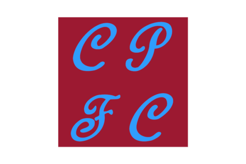
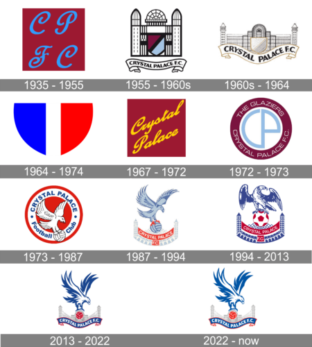
The initial badge of the British football club, which was used for almost twenty years, was a very simple yet still elegant square badge in dark burgundy with just four-letter on it. The upper level contained two smooth and orange blue “CP” letters, which stood for “Crystal Palace”, and the bottom line consisted of “FC” for “Football Club”, written in the same style and color.
1955 – 1960s
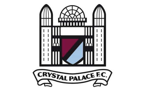
The first logo redesign was held by the club in 1955. And this is when a very interesting and detailed badge saw the light. It was a black and white stylized palace image with a burgundy and blue crest in the middle. The “Crystal Palace FC” wordmark was written in bold black sans-serif on a white horizontal ribbon in a black outline, placed under the image.
1960s – 1964
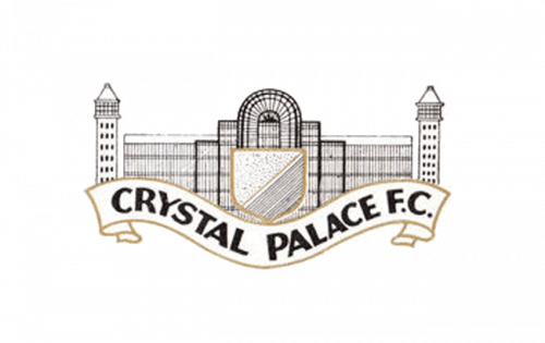
The redesign of the 1960s created a new image of the palace — a very detailed one, executed in many thin gray lines. The Crystal Palace crest on this version was executed in gray and white color palette and asked a thick gold frame, which was balanced by the gold framing of the wide wavy ribbon with the black bold logotype on it.
1964 – 1974

In 1964 the club started to use a bright and minimalist badge as the main part of its visual identity. It was an in framed smooth crest pouring down, with its left part in bright blue, and the right one — in scarlet red. The two parts were separated by a thick vertical white line.
1967 – 1972
The logo, introduced by the club in 1967, featured a solid burgundy square banner with yellow diagonal lettering on two levels. The “Crystal Palace” was executed in a smooth and elegant handwritten cursive, which evoked a light and tender feeling, though the intense color palette of the logo reflected the strong character of the club.
1972 – 1973
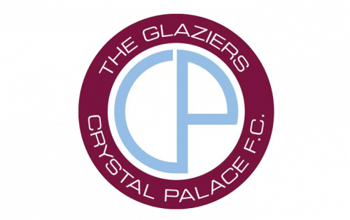
In 1972 a modern and minimalist badge in the Art-Deco style was created for the club. It was a circular emblem with the middle part in white with a light blue stylized “CP” monogram and a wide burgundy frame around it. The lettering was written around the perimeter of the frame, executed in a lightweight sans-serif typeface, with its uppercase letters looking fresh and stylish.
1973 – 1987
The iconic Crystal Palace Eagle appeared on the club’s logo in 1973. It was a new red white and blue circular badge with extra bold sans-serif lettering in blue written around the white framing of the logo. The eagle was drawn in white and outlined in thin black, placed on a red background and holding a white and black football.
1987 – 1994
The redesign of 1987 refined the eagle image in the Crystal Palace badge and switched the color palette of the club’s logo to blue in three shades and red. The bird with the football was now placed on the upper part of the badge, and under it — the stylized image of the palace in two light shades of blue. The white lettering was arched from the center under the Eagle, placed on two solid red ribbons.
1994 – 2013
While the following badge preserved the structure of its forerunner, the eagle now had a more aggressive, eagle-like look, as the club’s chairman Ron Noades supposed that the bird from the old logo could have been easily mistaken for a phoenix.
2013 – 2022
In advance of the 2013/14 playing season, the Crystal Palace new logo was introduced, which actually looks more like the 1973 badge than the 1993 one. It’s far from being an exact replica, though.
2020 – Today
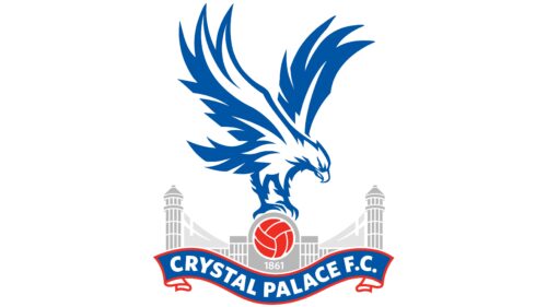
This and the previous version looks almost identical. Although the shapes and composition remain the same, the color palette changed. All the colors were made lighter and brighter. The most difference is seen in the blue and red. This color has long been associated with the strength, the quality of the ocean waters. This color is also associated with responsibility, commitment, and other positive qualities of this nature.
Color
The dark shade of blue is paired with a noble, saturated shade of red, while grey and white are used as secondary colors.
Crystal Palace Colors
BLUE
HEX COLOR: #1B458F
RGB: (27, 69, 143)
CMYK: (100,84,12,2)
PANTONE: 7686 C
GRAY
HEX COLOR: #A7A5A6
RGB: (167, 165, 166)
CMYK:(37,31,30,0)
PANTONE: PMS 442 C
RED
HEX COLOR: #C4122E
RGB: (196, 18, 46)
CMYK: (16,100,90,6)
PANTONE: PMS 200 C


