

![]() Chivas Logo PNG
Chivas Logo PNG
The logo of the Mexican football club Chivas emphasizes its long and illustrious history. Here, a sports emblem merges seamlessly with a medieval coat-of-arms.
Meaning and history
![]()
Club Deportivo Guadalajara (which is actually the full name of the franchise) was established in 1906. In 2016, it was named Mexico’s most popular team supported by 44% of football fans in Mexico.
1908 – 1911
![]()
This logo appeared soon after the club was established in 1906. It was a monogram that featured a decorative, old-style typeface that gave it a classic and majestic appearance. The red color enhanced an impressive and powerful feeling. At the same time, the logo was simple and featured a smooth, oval “C” intertwined with a more rectangular “G”. The letters stood for “Chivas de Guadalajara”.
1911 – 1917
![]()
The monogram now looked more artistic and had letters flipped, with the letters “G” being closer to a vertical oval and “C” being stretched out horizontally. Another noticeable update was the addition of a round border. The emblem preserved a red and white color palette.
1917 – 1923
![]()
The new logo looks abstract and geometric. The designers used red and white vertical stripes of the same width for the background. The dark blue, the almost black border also had the same width and created a vertical rectangle. In the center, the emblem had a white diamond with a dark blue frame and initials in the form of a letter “G” that was stylized as an incomplete diamond shape.
1923 – 1984
![]()
The heraldic shield symbol first appeared in 1923. It wasn’t as delicate as the next versions but at the same time held all the basic elements seen in all the upcoming emblems. First, it was a dark blue and white round shape with the name (Guadalajara) printed around the bottom. The center was filled with red and white vertical stripes seen in the previous logo. The top had yellow decorative elements on both sides of a light gray knight’s headwear and another icon with two lions.
1984 – 1987
![]()
This logo features the full name and more ornate and detailed yellow decorative elements at the very top. In addition, the logo acquired eight dark blue stars, which were placed in the bottom half of the logo following the round shape of the emblem. The lions, symbols of power and strength, were now standing on both sides of a green tree, a symbol of life. The logo turned out very symbolic and sophisticated thanks to all the details.
1987 – 1997
![]()
The logo looks almost identical to the previous version. However, an attentive eye will see an additional star at the bottom. It stood for yet another championship the club had won. The tree also got a bit browner in it.
1997 – 2002
![]()
The updated version featured much brighter colors, mainly blue. The blue was also used to outline the yellow decorative elements and the helmet. There were now ten stars along the bottom of the emblem.
2003 – 2006
![]()
The Chivas badge, used by the club for just one season in 2003, featured a bright and ornate composition with the circular blue medallion in a thick outline, with the white and red vertically-striped otters in the center, and a traditional crest with the gray knight helmet, placed on top of the badge. The lettering was written along the bottom part of the outline.
2006 – 2007
![]()
The redesign of 2006 has strengthened the color palette of the Chivas visual identity, using a deeper shade of red, which got closer to burgundy, and a darker tone of blue. These small modifications have created a stronger and a more professional look of the badge, showing the stability and confidence of the club.
2007 – 2009
![]()
The logo no longer had a bright red star at the very bottom. Instead, it simply had the same eleven blue stars running along the bottom of the circle. Other elements stayed the same.
2009 – 2010
![]()
There were several rather significant updates to the emblem many fans got used to. First of all, the designers have completely redrawn the knight’s headwear. The small crest with the lions underneath was now done in a red-and-white color palette. In addition, the yellow ornaments were simplified. There were several other small changes to the logo. Despite all these modifications, the emblem looked very recognizable, mainly because it had all the familiar elements and color palette.
2010 – 2017
![]()
During this period, the club used a logo it had earlier. It was the version seen during the 2007 – 2009 timeframe.
2017
![]()
A new championship brought a new logo. It was not that new as there was only one detail that has changed. It was an addition of a bright red star at the very top. The star had a smaller yellow star inside, which made it look more interesting and attracted even more attention.
2018
![]()
Similarly to what the club has already done before, the red star joined all the other stars. It was added to the eleven blue stars and looked no different than all of them. The logo itself acquired darker and more saturated colors. It looked even more powerful and bold – a true representation of one of the best clubs in the whole country.
2019 – 2020
![]()
For the first time in many years, the emblem was depicted without the stars at the bottom. All the club’s achievements were well-known and recognized even without these stars. In addition, every single new championship required the club to make adjustments to its emblem, which is very inconvenient. This was a more universal representation of the recognizable logo.
2020 – Today
![]()
It might seem that nothing has changed as often happens with logo modifications. Yet, the name was shortened to “Club Deportivo Guadalajara”. All the other elements were kept unchanged.
Symbol
The Chivas logo is basically a thick blue ring with red and white stripes inside. Over it, there’s a shield shape with a knight’s helmet. Each of the stars below the emblem stands for one of the championships the team has won. The emblem was developed in 1923 with reference to the coat-of-arms of the city of Guadalajara, Jalisco.
There’s more than one explanation as to why the Chivas uniforms (and, therefore, logo) feature stripes and the combination of red, white, and blue. According to the official history of the team, the color scheme has been influenced by the Flag of France.
There’s also an opinion that, in fact, the original kits of the Chivas were inspired by the uniforms of the Belgian Club Brugge K.V., which was the favorite club of the Chivas founder, Edgar Everaert. At least, the colors and the vertical stripes are supposed to have been borrowed from the logo the Brugge K.V. used at the era. The football club, in its turn, adopted the colors and stripes from the flag of its home city, Bruges.
Emblem
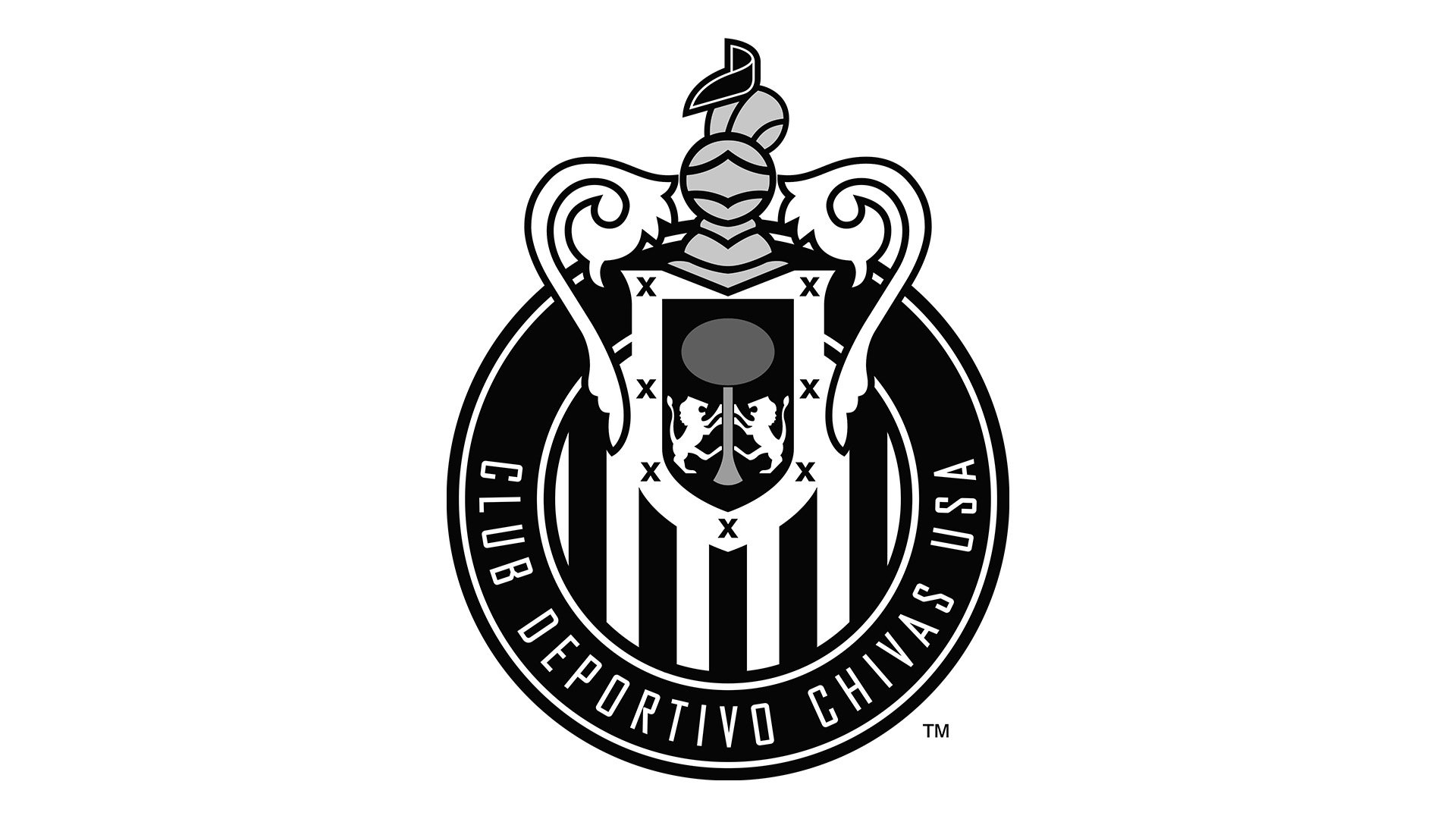
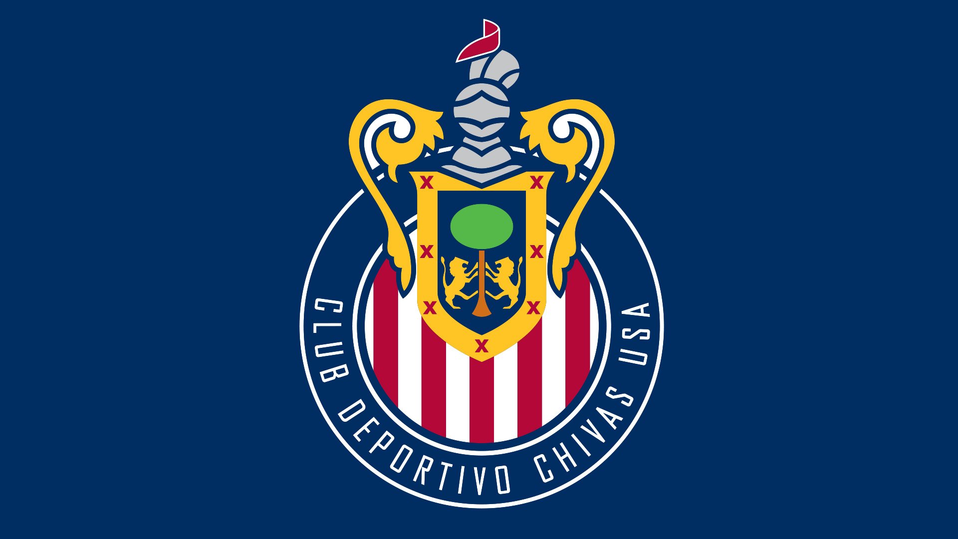
Club Deportivo Chivas USA was founded in 2004 and ceased to exist ten years later. Based in Carson, California, it competed in Major League Soccer and had the status a subsidiary of Mexican club C.D. Guadalajara. Although generally, it had the same branding as the parent club, you could also see a couple of distinctive features.
The 2005 Chivas logo showcased a shield topped with a knight’s helmet. The design was placed over a striped circle encircled by the lettering “Club Deportivo Chivas USA” in white. Just a year later, the color scheme was slightly modified. The most notable alteration was the introduction of a darker red and blue. Unlike the logo of the parent team, the Chivas USA emblem didn’t feature stars.
Font
![]()
The team chose a simple sans serif type. There’s a lot of breathing space, so the overall effect is very clear and transparent. And yet, the letters can be illegible at smaller sizes because of their thin lines.
Colors
![]()
While the palette of the Club Deportivo Guadalajara logo has been inspired by the kits, in fact, it’s much more diverse. In addition to the red, blue, and white used on the uniforms, the emblem also features gold, green, and grey. The shade of blue is dark and noble.


