Cricket Wireless is an American brand of a wireless communications provider, which was established in 1999. The company is a part of AT&T Groups and has over 5 thousand locations across the country.
Meaning and history
The Cricket Wireless visual identity is based on the wordmark and a simple minimalist color accent in it.
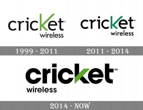
1999 – 2011

The very first badge for Cricket Wireless was created in 1999. It was a black lowercase logotype in a traditional sans-serif typeface with the letter “K” stylized and enlarged. The “Wireless” part of the nameplate was set under the right part of the “Cricket”, written in small letters of the same sans-serif font. The whole logo was executed in black, and only the “K” was colored grass-green, a color of success and development.
2011 – 2014

The redesign of 2011 emboldened the lines of the logo and slightly changed the contours of the “K”, making its lines shorter but spreading them wider. The color palette was also a bit changed, but only the green shade, which became calmer and darker, adding a touch of professionalism and stability to the whole image.
2014 – Today
The logo, designed by the brand in 2014, features two levels of the wordmark in different sizes. The bold and massive “Cricket” part in the lowercase is executed in a clean and neat sans-serif, where the letters “C” and “E” have perfect circular shapes.
The “Wireless” part is placed under the “Cricket” and written in smaller and thinner lettering using the same font.
The strict and traditional monochrome palette of the Cricket logo is diluted with a bright groin diagonal of the letter “K”. Symbolizing progress and innovations, the signature brand’s “K” is also used as the company’s icon.
The Cricket mobile app icon is composed of a green square with rounded angles and a bold black “K” with a white diagonal bar.
The color palette of the Cricket logo creates a sense of energy and balance, while the shapes and lines of the wordmark show a professional and reliable brand.


