EE is Britain’s second-largest mobile network operator. It is also considered the largest provider of 4G services in Europe. It was started as a joint venture between Deutsche Telekom and France Télécom and was purchased by British telecom company BT in 2016.
Meaning and history
The rebranding of 2012 was a major turning point in the way the EE logo looks. That was when the design went through a complete overhaul, which resulted in a more recognizable logo. The company behind the new identity was Wolff Olins.
What is EE
EE is a UK mobile network operator and internet service provider. It belongs to the BT Group. In late 2020, it had 27.5 million subscribers. Between 2010 and 2012, the brand was known as Everything Everywhere.
2010 – 2012 (Everything Everywhere)
In 2009-2010, Deutsche Telekom and France Télécom combined their UK ventures – T-Mobile UK and Orange UK – into a joint venture. They named it Everything Everywhere.
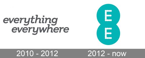
The original logo was perfectly straightforward. There was nothing but the name of the brand, not a single pictorial element. Moreover, the type was pretty generic, which meant it wasn’t very memorable and didn’t catch the eye.
The wordmark was set in lowercase letters. They were italicized, which added a subtle dynamic touch. While the type was a sans serif one, you could notice tiny “excessive” strokes at the ends of the letters here and there.
As a result, the logo was easy to grasp and there was no problem with attributing it to a certain brand. On the downside, it didn’t create any distinct image or emotional response in the brains of the consumers. It just informed.
The letters were colored in a dark shade of gray. It created enough contrast to be visible when placed over white or another light background. Then again, gray is a hardly memorable color and it added nothing to make the visual brand identity recognizable.
2012 – present (EE)
Starting from the fall of 2012, the Everything Everywhere brand was being phased out. The Orange and T-Mobile brands in the UK were phased out over 2014-2015. The services were rebranded as EE. The rebranding was part of the 4G launch and the introduction of fiber optic broadband.
The new name was accompanied by a dramatically different logo. This time, it had a pictorial quality, which made it memorable and recognizable.
The underlying shape was the number “8.” Technically speaking, the EE logo consisted of two identical circles, each housing the letter “E.” The circles were positioned one above the other and partly overlapped. This is where the “eight” or “infinity” shape came from.
The overlapping circles were echoed in the shape of the letters, too. You can easily notice that the glyphs are made up of tiny circles. Sometimes, they overlap (in the vertical parts), sometimes they are just positioned one above another (in the horizontal parts).
The letters are white, while the two larger circles in the background are teal. In comparison with the gray of the previous logo, this one looks by far better recognizable and memorable. Another version features teal letters inside bright yellow circles. This palette is by far more eye-catching. When used on signs, this logo is placed inside a larger teal rectangle.
On the one hand, the new proportions made the logo slightly more difficult to be used across different media. On the other hand, they contributed to its unique style.
Colors and font
The EE logo can be set either in teal and white or in teal and yellow.
The typography is worth special attention. The unique overlapping circles style more than makes up for the simple, basic shape of the letters.


