One of the most popular brands of tools, lawn and garden equipment, Craftsman has always built its logo around the wordmark and refused of additional imagery.
Meaning and history
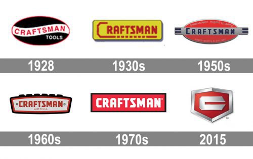
The history of the Craftsman visual identity features many radical redesigned, where the style of the brand was changed completely, and the current version, introduced in 2015 is something extremely different from what the company used to have before.
1928 — The 1930s
The very first Craftsman logo, introduced in 1928, featured a solid black oval, which was horizontally oriented and outlines in red. The wide smooth banner in white was crossing the badge horizontally, is also outlined in red, and having bold red lettering on it. The wordmark was executed in a simple yet solid sans-serif typeface and was accompanied by a delicate white “Tools” tagline, placed on a black background, under the right part of the banner.
The 1930s
The redesign of the thirties brought a new bright badge to the brand, and now its logotype in red square sans-serif was placed on a yellow horizontal rectangle with a delicate outline and shadow. The wordmark had all of its letters capitalized, but the “C” was enlarged and had its tail elongated, underlining the whole inscription,l.
The 1960s — The 1970s
The new badge was designed in the 1960s, and it was a modern and sleek emblem in light gray, with a double red and black outline and a stylish and edgy wordmark in red, repeating the typeface of the previous version. The tagline “Made in the USA” was written in a lightweight sans-serif, using the same red color. Two rounded screws were drawn on the badge, to show its metal structure and the purpose of the brand.
The 1970s — Today
Another badge was created in the 1970s and it is still in use by the brand today along with the newest badge, introduced in 2015. The emblem features a solid red rectangle in a black outline with white bold lettering inside. The wordmark is executed in the same unique Craftsman typeface, but with its contours refined.
2015 — Today
In 2015 the company starts using a modern and sleek badge, which resembles a logo for luxury cars. It is a shield-shaped emblem in a thick silver outline, executed in glossy gradient shades, which make the badge three-dimensional. The main color of the shield is red, and the silver stylized letter “C” in bold lines with diagonal cuts is placed in its center.
Current symbol
Around the same time as the yellow box logo was adopted, the company developed one more version of the emblem, which is still in use. It features white letters in a red rectangle with the black border.
Alternative emblem
Large stick tools and store signs feature an icon with the letter “C” enclosed in a shield.
Font
The bold custom font seen on the Craftsman logo belongs to the sans serif family.


