Corvette is probably the world’s most famous sport-car models, designed by Chevrolet. The first Corvette was produced in 1953 and since then became extremely popular in America and then, worldwide.
Meaning and history
The brand Corvette was named after a small ship and is also knows across the globe as Vette. The first convertible model was performed in 1953 and in ten years Chevrolet designed the second generation of its sport-car.
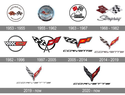
The Corvette logo was created in 1953 and the main idea never changed, it was only modified and modernized during the brand’s history.
What is Corvette?
Corvette is the name of a sports car model, which is produced by the American Chevrolet automaker. The first Corvette saw the light at the beginning of the 1950s, and by today has become a symbol of the American sports cars industry.
1953 – 1955
The first Corvette logo was designed in 1953 by Robert Bartholomew and stayed with the band for nine years. It was composed of a round emblem with a white background and two crossed flags. One of the flags features a checkered monochrome racing pattern, while the second was colored red with a picture of fleur-de-lis and three horizontal lines. The iconic French Emblem was a celebration of the company’s heritage.
The wordmark of the original logo was composed of two parts — the big and bold “Chevrolet”, placed on the top of the emblem and an elegant “Corvette” in cursive, place at the bottom part.
1955 – 1962
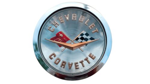
The redesign of 1955 has modernized and strengthened the Corvette logo, by placing the refined elements from the previous version in a glossy silver rounded medallion. The lettering was rewritten in a more distinctive geometric sans-serif typeface, creating a more brutal and powerful look of the whole insignia.
1963 – 1967
The logo redesign of 1962 featured enlarged flags and removed wordmark. The letter “V” was added to the Corvette visual identity in order to celebrate the car’s V-8 engine.
1968 – 1982
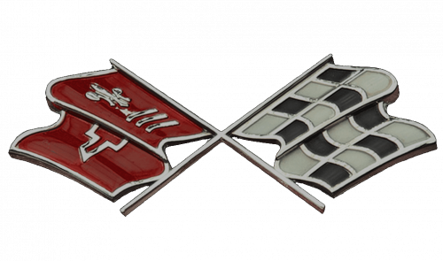
In 1967 the flags were modified by flattening and becoming more geometric. The logo now looks stronger and more confident.
1982 – 1996
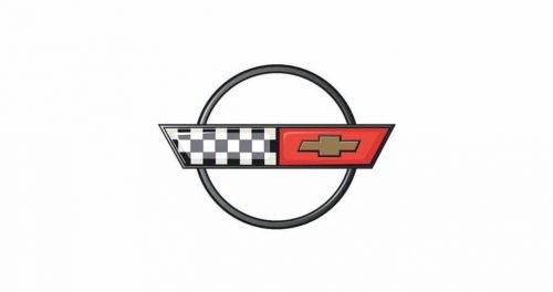
The completely different design approach was born in 1984. The Corvette logo was redesigned and now featured a circle with a long thick rectangular crossing it. The rectangular consisted of two parts. The left part was still a checkered flag, while the right part was composed of a Chevrolet symbol on a solid background.
1997 – 2005
In 1997 the brand introduces the new model of the iconic car, C5 Corvette. The logo was redesigned again and came back to the traditional emblem, the flags switched their sides and now the red flag was on the right and the monochrome — on the left.
2005 – 2014
The Corvette logo from 2004 featured shortened lines and a more compact design. Now it looks neater and more laconic, the circle is removed again. The red flag was executed in two different shades, which added volume and dynamics to the emblem.
2014 – 2019
The Corvette logo from 2014 features futuristic bold forms and lines of the flags. There is no circle outline and the emblem gains a triangular shape. The logo looks sleek and modern. The outline of the flags is made in thick silver lines.
2019 – Today
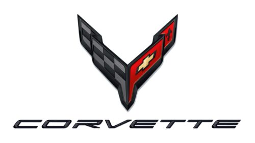
New Corvette logo is designed for the C8 Corvette and features the same two crossed flags, composing the letter “V” but in stronger and sharper lines. It looks powerful and energetic. The fleur-de-lis symbol is also slightly modernized.
2020 – Today
In 2020 the Corvette logo was redesigned again, keeping the style and idea of the previous version, yet adding more dark shades and emboldening the lines of the emblem. As for the lettering part, it is now set in plain black, using the same typeface as on the badge from 2019, yet in the new color it looks bolder and stronger.
What does the Corvette logo mean?
The Corvette logo is composed of two stylized flags, which are connected and form the horizontally extended letter “V”; which probably stands for the “Victory”. As for the flags, the checkered black-and-white one is here is a symbol of racing, and the second one, with the fleur-de-lys on it, is there as an honor of the French founder of the company, Louise Chevrolet.
Why is the 2020 Corvette so cheap?
In 2020 Chevrolet was trying to recover from the economic crisis, caused by the pandemic of 2019, and decided to make the price of the Corvette Stingray more affordable, to sell more. However, the trick didn’t work out well, and the company lost a lot on this marketing strategy.
Who made the Corvette logo?
The version of the Corvette badge from 1953 was designed by Robert Bartholomew, who was working on the company as the designer of the cars’ interior. As for the current badge of the American sports car brand, the name of its author is unknown.
Is the Chevy logo on the Corvette?
The Corvette cars have their Corvette logos placed on the bonnets, not the Chevrolet ones, however, the fleur-de-lys symbol on one of the flags of the Corvette badge represents the roots of the company and the French background of its founder.


