Corsair is the name of a computer-hardware manufacturer, which was established in 1994 in the United States. The company specializes in the production of accessories and modules for computer gaming and distributes its products all over the world, having a yearly revenue of about one billion USD.
Meaning and history
The visual identity of Corsair is all about the name of the brand, not the products it is famous for. The elegant and sleek emblem looks like the one designed for a casual men’s fashion label, or you could also picture it on the cover of the book about pirates, its contemporary edition. Once introduced in 1994, the logo was modernized only in 2015, keeping the main elements in their places.
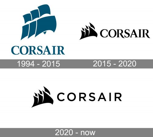
1994 — 2015
The original logo, designed in 1994, was composed of a blue emblem and a wordmark in the same color, which was usually placed under the icon, but sometimes — in one line with it. The emblem depicted three ship’s sails, placed diagonally, and overlapping each other.
As for the wordmark, it was written in all capitals of a bold serif typeface, which looked elegant and confident.
2015 — 2020
The redesign of 2015 hasn’t changed the style and composition of the Corsair visual identity but made the sails of the emblem sharper and more triangular, which made them look more modern and strong. The blue color was replaced with black, so now the whole logo is monochrome, and it allows placing it on various backgrounds and surfaces.
The lettering was also slightly refined — the tail of the “R” is elongated and curved and its contour is now a bit open.


